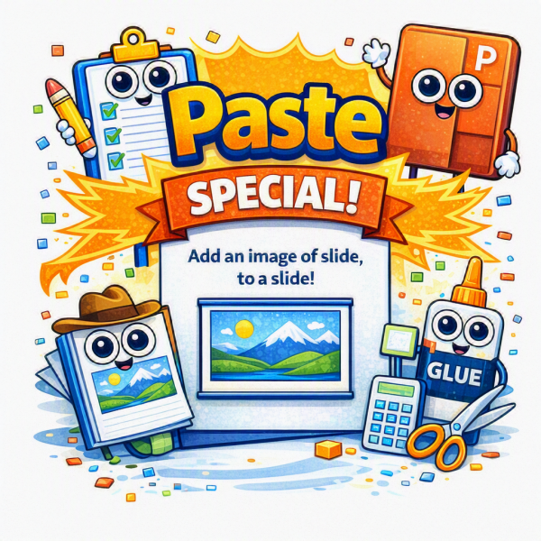
PowerPoint “Paste Special” Tip – Add an Image of a Slide, to a Slide
Need an image of a slide, on your slide? We do – often! Here is a quick PowerPoint trick that will create a full-size image of any slide in just a couple of clicks.
This is built into PowerPoint, if you know about using Paste Special to convert a slide into a PNG or JPEG instantly.
Here’s how to do it:
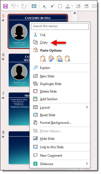
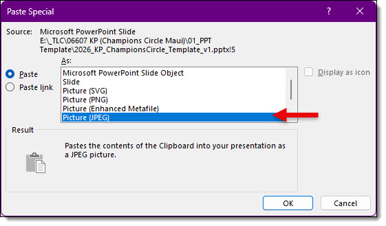
1. In the thumbnail pane on the left side of PowerPoint, select the slide to convert to an image and right-click the thumbnail
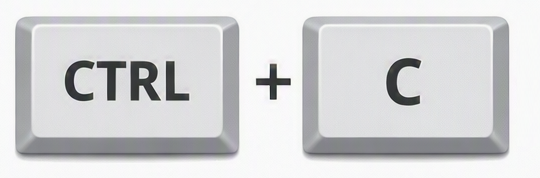
2. Choose COPY or press CTRL + C
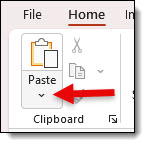
3. Go to HOME tab
4. Click the PASTE drop-down
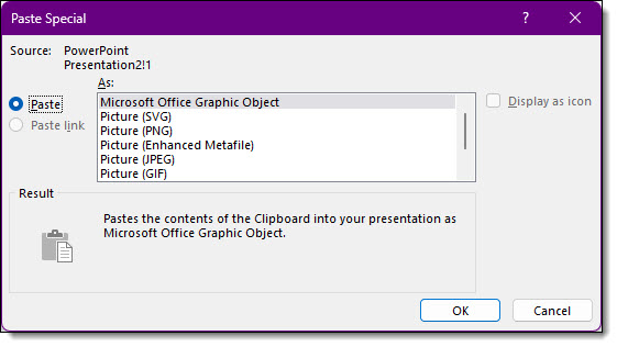
5. Select PASTE SPECIAL
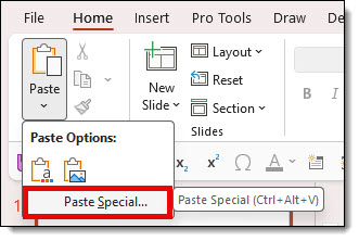
6. Choose an image format and click OK
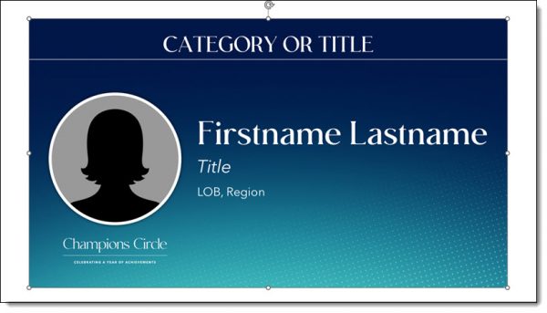
That’s it! PowerPoint creates a full-resolution image of the entire slide, which is inserted as a single picture. Unlike the original slide, the image can’t be edited object by object, but it can be resized, cropped, rotated, or have picture formatting applied (inserted here slightly smaller than the slide to see it is an image of the original slide, on a new slide, all created in just a few clicks!).
TIP: Make this a 1-click formatting option. If you haven’t already added Paste Special – PNG to your QAT (Quick Access Toolbar), check out the on how to add this super helpful shortcut to your PowerPoint setup. This of course is if you are working in PowerPoint Windows desktop app. See the July 16, 2026 post, PowerPoint “Paste Special” Tip – Make it a QAT Button.
-Troy and the TLC Creative presentation design team
New Podcast Episode Available! “Here’s An Interesting AI-Presentation Use Case”
New episode of The Presentation Podcast now available!
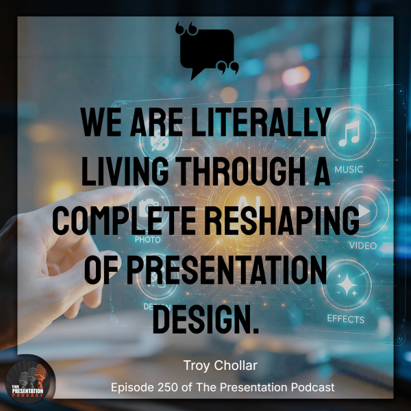
Episode 250 of the Presentation Podcast brings together industry experts Troy Chollar, Sandy Johnson, Nolan Hames for a deep dive into how artificial intelligence (AI) is reshaping the workflow of professional presentation design. Drawing from a real-world case study Lori Chollar of TLC Creative Services talks about a real-world success story that is literally at the intersection of AI and presentation design. Lori shares how an end client leveraged AI to develop a reference presentation before engaging the presentation design team. Listen on your favorite podcast app, or at The Presentation Podcast site here.
PowerPoint “Paste Special” Tip – Make it a QAT Button
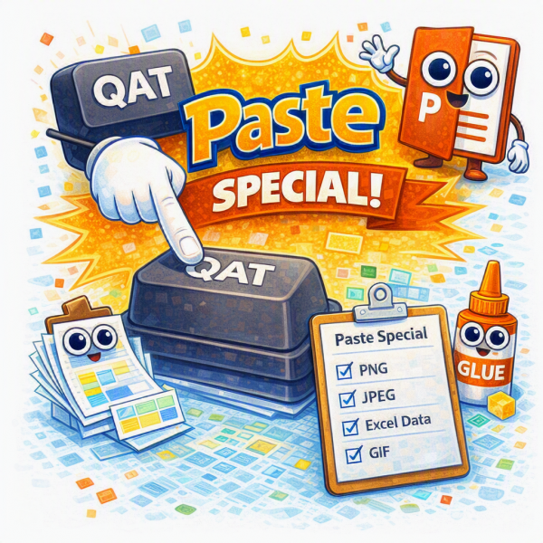
If you regularly use Paste Special in PowerPoint, navigating through Home > Paste > Paste Special every time can quickly become repetitive. The TLC Creative Services design team uses Paste Special dozens of times a day – most often to paste content as a PNG image. To optimize our workflow, we’ve added Paste Special as .PNG directly to the PowerPoint Quick Access Toolbar (QAT), turning a multi-click process into a single click.
The QAT is always visible, regardless of which ribbon tab is open. Adding frequently used commands means less time spent navigating menus and more time designing, this is definitely a great power-user setup hack!
Here’s how to add Paste Special to the Quick Access Toolbar:
1. Click the small Customize Quick Access Toolbar arrow on the QAT
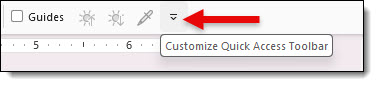
2. Select MORE COMMANDS
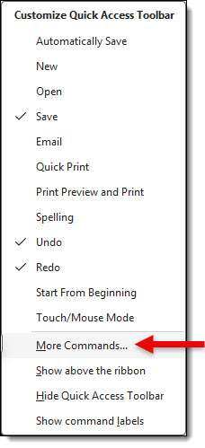
3. In the CHOOSE COMMANDS FROM dropdown, select ALL COMMANDS
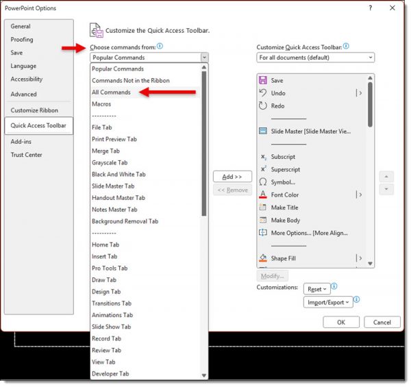
4. Scroll down to PASTE SPECIAL
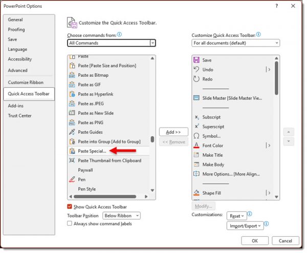
5. Click ADD >>
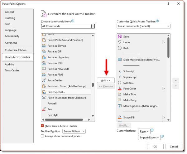
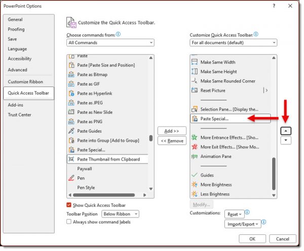
6. Optional – use the MOVE UP button to position it where you’d like on the toolbar
7. Click OK
The Paste Special button will now appear in the Quick Access Toolbar and be available no matter which ribbon tab is active.
![]()
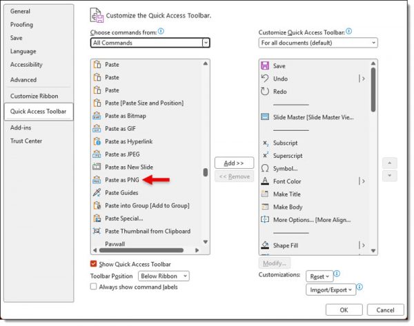
Paste as PNG can also be added to the QAT by following the same steps and choosing PASTE AS PNG from ALL COMMANDS. While Paste Special offers several formats, the design team most often selects Picture (PNG) because it provides a great balance of quality and reliability. We still use other Paste Special options when appropriate, but PNG is our default choice for most design work.
-Troy and the TLC Creative presentation design team
PowerPoint “Paste Special”- 5 Special Paste Options TLC Creative Uses Often
Most PowerPoint users simply press CTRL+V to paste copied content. Definitely the way to work (especially using a keyboard shortcut!). But, while this works most of the time, PowerPoint actually gives us much more control when pasting in content when using Paste Special.
Paste Special lets you choose exactly how copied content is inserted into your presentation instead of relying on PowerPoint’s automatic paste behavior.
Depending on what you’ve copied, PowerPoint can offer several paste options. Note: The options available change depending on the type of content on the clipboard. These include:
- PNG
- JPEG
- SVG
- EMF (Enhanced Metafile) – it’s an old vector graphic format, and PowerPoint still supports it!
- GIF
- Microsoft Excel Worksheet Object
- and more!
How to utilize Paste Special:
- Copy the PowerPoint content using CTRL + C
- In PowerPoint, go to the HOME tab
- Click the Paste drop-down arrow

- Select PASTE SPECIAL

- Choose best option for content and click OK
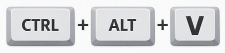
TIP: there is also a keyboard shortcut to open the Paste Special dialog! Use: CTRL + ALT + V.
Here are our 5 most commonly seen and used Paste Special options:
- Picture (PNG): usually the best choice for graphics, icons, screenshots, and illustrations. Supports transparent backgrounds, produces crisp text and graphics, lossless image quality.
- Picture (JPEG): designed for photographs rather than graphics. Smaller file size, uses lossy compression, text and sharp graphics may appear softer, transparent areas become a solid color (almost always a white background – the template background style does not affect this).
- Scalable Vector Graphic (SVG): vector-based graphic, so the graphic stays sharp when resized, often allows ungrouping into editable vector shapes.
- GIF: special note here, Paste Special as a GIF only supports static GIF images, not animated.
- PowerPoint Object: when copying slides or PowerPoint content this preserves the original object. Fully editable, retains animations, preserves PowerPoint formatting.
Return here for our mini-series of tips and tricks of using PowerPoint’s Paste Special feature!
-Troy and the TLC Creative presentation design team
Why Do We Say “PPT”?
“The updated PPT is in process.
“Do you have bandwidth to help design a new PPT?
“Look at the PPT slide 23 layout!
Question, why do people say “PPT” when referencing a PowerPoint file?
The answer is almost 20 years old, which proves it is difficult to change a name once it has been assigned!
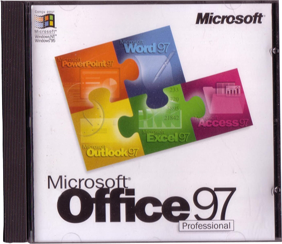
We are going back even further, to 1997, when Microsoft released Office 97. PowerPoint was in the Office 97 bundle and all Office files; Word, Excel, PowerPoint, used 3-letter file extensions. PowerPoint files had the extension .ppt. So when hear some reference a PowerPoint file as a “PPT”, they are literally referencing a file format from over 2 decades ago!
Why did we start with saying the answer is almost 20 years old?
Because in 2007, 19 years ago, Microsoft release Office 2007. Office 2007 gave us the modern version of PowerPoint, powered largely by PowerPoint being rebuilt in the Office Open XML (OOXML) standard. With this update all of the 3-letter file extensions added the letter “X” for the new 4-letter file extensions; .pptx, .docx, .xlsx, etc. The “X” representing the XML code base.

And why did we say the XML version of PowerPoint, .pptx, is the modern version?
Because each XML file is really a .zip folder with all of the XML code, images, text files, videos and more inside that PowerPoint uses to display the slides. Modern meaning smaller file sizes (it is a .zip folder!), modular components inside (so 1 corrupt file does not ruin the entire presentation!), interoperability (the XML file structure is how Apple Keynote, Google Slides and every other presentation program can convert their presentation to a PowerPoint file!), embedded video and audio (it is a .zip folder, so things like videos and audio files can be added!).

-Troy @ TLC
New Podcast Episode Available! “Exploring the Balance Between AI Assistance and Human Expertise in Modern Presentation Design”
New episode of The Presentation Podcast now available!
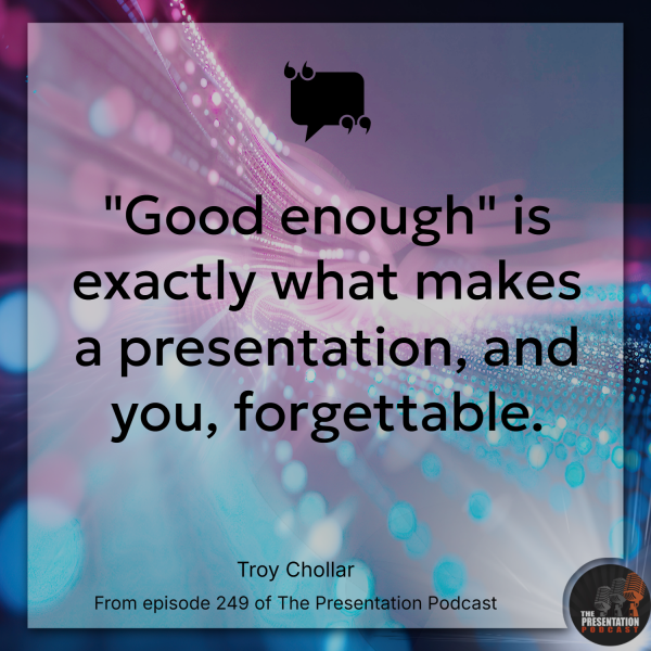
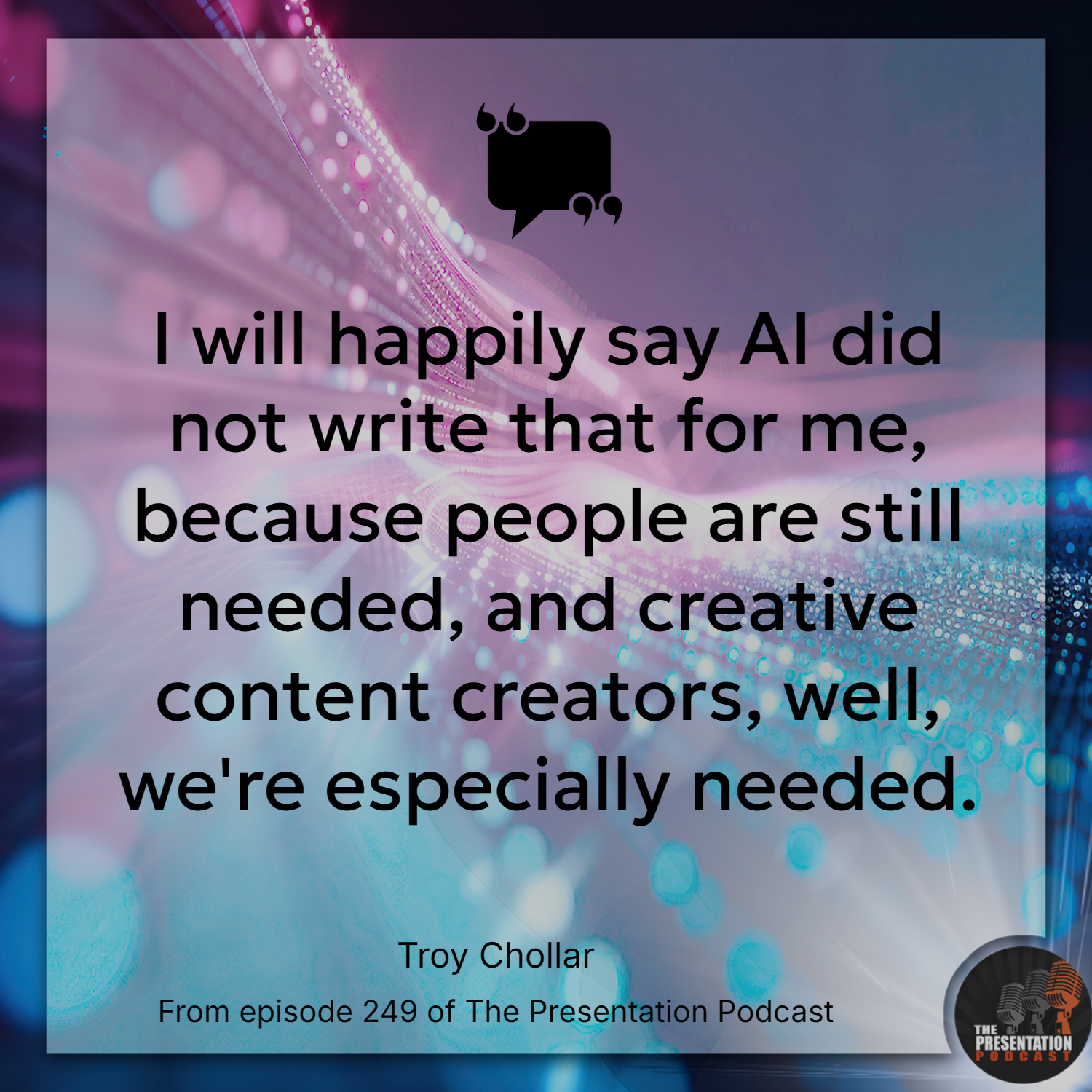
In this podcast episode, Troy, Nolan, and Sandy explore how AI is reshaping presentation design today. The conversation revolves around the two key spaces where AI operates: thinking (e.g. outlining, structuring) and design (e.g. visuals, layouts). While all three agree AI enhances efficiency, they also agree AI is not set to replace human storytelling, editorial judgment, and contextual understanding in professional presentation design. Ultimately, as AI produces “good enough” results, which makes human expertise more critical in creating authentic, memorable presentations that stand out.
Listen on your favorite podcast app, or at The Presentation Podcast site here.
New Podcast Episode Available! “Exploring the Balance Between AI Assistance and Human Expertise in Modern Presentation Design”
New episode of The Presentation Podcast now available!
In this podcast episode, Troy, Nolan, and Sandy explore how AI is reshaping presentation design today. The conversation revolves around the two key spaces where AI operates: thinking (e.g. outlining, structuring) and design (e.g. visuals, layouts). While all three agree AI enhances efficiency, they also agree AI is not set to replace human storytelling, editorial judgment, and contextual understanding in professional presentation design. Since AI produces “good enough” results, which makes human expertise more critical in creating authentic, memorable presentations that stand out.
Listen on your favorite podcast app, or at The Presentation Podcast site here!