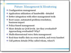
Here is a sample from a recent project (logos, names and telling content have been removed to protect the design challenged). Here is the original slide:
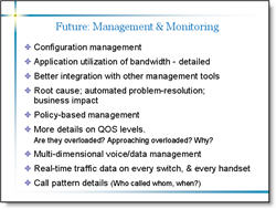
Here is the revised slide:
I was somewhat limited in what could be done. Things like the template could not be altered, content could not be edited, etc. But here are some details of what was adjusted:
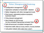
(1) I adjusted the template so the content text box was separated a bit more from the header text.
(2) I changed the font to a more legible Arial, which does not have the serifs (small ‘hooks’ on the end of the letters)
(3) I adjusted the overall line spacing from 0 to .35, this gives a bit of room between each bullet and allows the brain to “clump” the content into sections – which makes it more legible.
(4) Used a soft return (SHIFT RETURN) and made sub-content on its own line and reduced its font size. Did the same with the sub-content at the end of the last bullet.
There is a lot of small things that can be done to text heavy slides to make them more legible. The problem is that this usually involves modifying the content on a slide-by-slide basis, which can be time consuming. But the results are an audience the is able to understand your message clearer!
Troy @ TLC