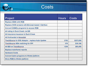
A recent project involved taking a good presentation and making it great. I had some very clean and easy to read PowerPoint tables. They conveyed the information and made good use of the tools in the application. Here is the original:
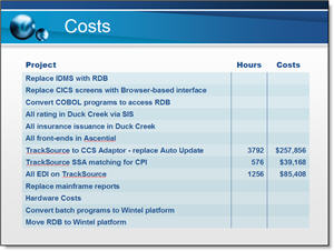
But the goal was to add visual dynamics to the presentation and this means making all elements coordinate with a common color scheme, font use and positioning. Here is the same table with some additional formatting:
– Troy @ TLC