powerpoint

How Long Was Each Slide Displayed?

Turning PowerPoint presentations into webcasts has become a fairly routine request. One of the more difficult aspects of recreating a presentation is knowing when the presenter advances the slide. This is critical in syncing video of the presenter with the slides. Here is one method I have used – and best of all it is built into PowerPoint!

A few points about this process:
1 – This is at larger conferences where I am backstage running the presentations.
2 – I am running a backup computer and I run this timer on it.
3 – I use a remote system so both computers advance simulataneously.

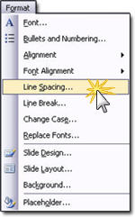
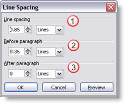
(1) With the presentation open go to SLIDESHOW >> REHEARSE TIMINGS

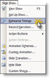
(2) The slide show begins and a pop-up timer is visible.

TIP 1: As soon as the Timer window is visible click the PAUSE button. When the meeting begins click the PLAY button (the last thing I want is to have to many things distract me at the beginning of a meeting!).

TIP 2: Even though the timer is running on the backup computer, drag the timer to the very bottom so it is virtually invisible – just in case you have to switch to it!

(3) When the presentation is done click YES to the save the timings.

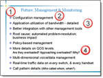
(4) Each slides time onscreen is seen next to the slide thumbnail. Be sure to do a SAVE AS to keep these timings for reference when building the webcast.

– Troy @ TLC

By |2016-11-17T14:11:56-07:00August 16th, 2006|Tutorial|

Visio is Nifty, But Not Pretty

MS Visio is a great tool for putting complex processes into a visual layout. But, like most business applications, it does not have a lot of visual aesthetics. Here is a slide from a recent project:

The best thing about this slide (to me), is the client was able to quickly create something that showed me exactly what they wanted.

My job was to inject some visual dynamics to the presentation. So a few hours of working in PhotoShop and PowerPoint the same information now looks like this:

Same information – just a slightly enhanced presentation of it!

– Troy @ TLC

By |2016-11-17T14:10:25-07:00August 8th, 2006|Portfolio|

Line Spacing and the Magic of F4

Here is our sample text.

To help visually cluster the information by the primary bullets we position the cursor on the second bullet and add additional spacing BEFORE PARAGRAPH of 0.5

Now to do the same for the third bullet we can either position the cursor on the third bullet line, open the Line Spacing dialog and enter the new distance OR we position the cursor on the third bullet line and click the F4 button!

F4 is a keyboard shortcut in PowerPoint that repeats whatever the last action was. In this case it automatically changes the BEFORE PARAGRAPH line spacing from 0.2 to 0.5, matching the bullet above!

-Troy @ TLC

By |2016-11-17T14:07:36-07:00July 24th, 2006|Tutorial|

What Does Line Spacing Do?

Here is a sample three lines of text and the default line spacing dialog.

If I select the entire text box and change the LINE SPACING all of the lines move further apart as you can see here.

If I place the cursor in line 2 and add BEFORE PARAGRAPH space, the distance between line 2 and line 1 increases. The distance between line 2 and 3 remains the same.

If instead I place the cursor on line 2 and add AFTER PARAGRAPH space, the distance between line 2 and 3 increases. While the distance between line 1 and 2 remains the same.

-Troy @ TLC

By |2016-11-17T14:07:17-07:00July 22nd, 2006|Tutorial|

Access Line Spacing Dialog

With your cursor positioned at the line to be adjusted, or with the entire text box selected (will globally change all lines in text box), go to FORMAT LINE SPACING.

This brings up the Line Spacing Dialog which has three settings that can be adjusted.

(1) Adjusts the distance between the lines of a paragraph.
(2) Adjusts the distance between the start of this paragraph and the one above it (separated by a hard return).
(3) Adjusts the distance between the last line of this paragraph and the one below it (separated by a hard return).

-Troy @ TLC

By |2016-11-17T14:06:58-07:00July 20th, 2006|Tutorial|

Use Line Spacing to Increase Legibility

Here is a sample from a recent project (logos, names and telling content have been removed to protect the design challenged). Here is the original slide:

Here is the revised slide:

I was somewhat limited in what could be done. Things like the template could not be altered, content could not be edited, etc. But here are some details of what was adjusted:

(1) I adjusted the template so the content text box was separated a bit more from the header text.
(2) I changed the font to a more legible Arial, which does not have the serifs (small ‘hooks’ on the end of the letters)
(3) I adjusted the overall line spacing from 0 to .35, this gives a bit of room between each bullet and allows the brain to “clump” the content into sections – which makes it more legible.
(4) Used a soft return (SHIFT RETURN) and made sub-content on its own line and reduced its font size. Did the same with the sub-content at the end of the last bullet.

There is a lot of small things that can be done to text heavy slides to make them more legible. The problem is that this usually involves modifying the content on a slide-by-slide basis, which can be time consuming. But the results are an audience the is able to understand your message clearer!

Troy @ TLC

By |2016-11-17T14:06:38-07:00July 18th, 2006|Portfolio, Tutorial|

4th of July template

Happy 4th of July!! The states are awash with patriotism and we are off for our annual trip to the state fair where we end the day listening to the Navy Band and watching a huge fireworks show.

There are lots of great template sites out there, and it is not something I have focused on (providing a library of downloadable templates). But I designed this Americana themed template to share with all. Download here (580k).

Troy @ TLC

By |2016-11-17T14:04:24-07:00July 4th, 2006|Templates/Assets|

Online Movie Tutorial : Export image from PPT to add PhotoShop Dropshadow

I have just completed a screen capture tutorial that walks through the process of exporting an image from a presentation, opening it in PhotoShop, adding a soft dropshadow, properly saving it out and then inserting back into the presentation. This is a 4 minute narrated online movie, because if a picture is worth a 1,000 words, seeing a real demonstration is worth hours of frustration! To view click here.

– Troy @ TLC

By |2016-11-17T14:03:10-07:00June 28th, 2006|Tutorial|

Animation with AutoShapes Gone Wild!

I have had this file from fellow PPT MVP “Tohlz” for a while and just got around to viewing it. Wow!

The content is nifty, the animations great, but what really impressed me was that the entire presentation/movie is made from a complex use of PowerPoint autoshapes! This includes the 3D effects, the highlights, everything. I would develop this using a couple dozen PhotoShop created .png images and call it a day, but making them all with autoshapes creates a small file size and shows lots of creative thinking!

Made Only With PPT Autoshapes
View it out at the “Evolution Warriors” here.

– Troy @ TLC

By |2016-11-17T14:01:44-07:00June 24th, 2006|PowerPoint|

From Word –to- Bullets –to- Visuals

Here is a good example of the process of developing an audience-friendly presentation. One that visually shows the concept, does not overwhelm the audience with words/statistics and supports the speakers message.

(1) Client provides an outline of the presentation content written in paragraph form. I added the red slide markers.
MS Word Outline

(2) First draft is distilling the paragraphs into bulleted information, which the client reviews and verifies the needed message is intact.
Bulleted PPT

(3) The bullets are then distilled into visual elements. The goal is to minimize the number of words, while adding visual elements that support the remaining text and help convey the message.
Visual PPT
In addition, slides have animations that allow the speaker to lead the audience through the message of the slide.

– Troy @ TLC

By |2016-11-17T14:00:39-07:00June 19th, 2006|Portfolio|
Go to Top