photoshop

Lance Armstrong Animated Slide

People ask all kinds of questions about slides created. If it is a cool topic like this one, Lance Armstrong, I hear “Wow, that is really awesome to work on stuff like that.” But the comment about the same slide from the client is usually, “How long did it take to create that really awesome slide…”. Just depends on your perspective.

But this was an awesome slide to have the opportunity to develop for a presentation. Awesome subject. Awesome photography. Awesome animation. Here is the image preparation needed in Photoshop:
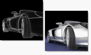
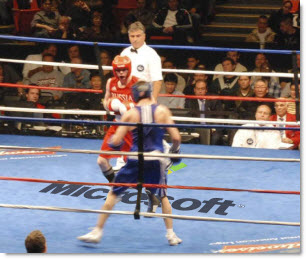
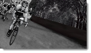
1. Original Photo

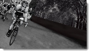
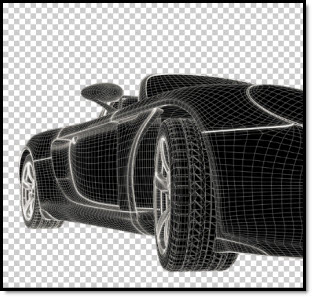
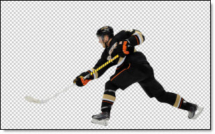
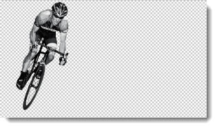
2. Drop out background and have just Lance Armstrong

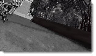
3. Make background without Lance Armstrong

4. Create motion streaks of Lance Armstrong speeding away (key for the animation)

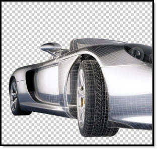
5. Create semi-transparent background image

Here is what it took to create the animated slide:

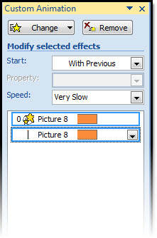
1. start with opaque background image and .png image of Lance Armstrong (looks like original)

2. Fade in the motion streaks .png image

3. Grow/shrink and slight motion path on Lance Armstrong image and motion streaks. Fade out opaque background and fade in semi transparent background

4. Done. Total billable time – few hours. Result – (hopefully) audience wow.

– Troy @ TLC

By |2016-08-16T11:03:56-07:00September 23rd, 2010|Tutorial|

Design For Speed Slide

This is from a recent presentation project.
Designing For Speed Sample Slide

The slide started with 2 original images:

In photoshop I dropped out the background of each and saved as .png images with transparency.

Then each image was inserted to the slide, a simple FADE IN animation applied to the top image for the transformation.

– Troy @ TLC

By |2016-08-16T11:28:32-07:00June 9th, 2010|Portfolio|

Zoom and Pan Animation Sample (Hockey)

Living in Southern California, Hockey is not really a focus for me. But with the excitement of the Winter Olympics hockey match up I was inspired to create this animation example. A popular animation effect used in recently (especially in commercials) is a zoom and pan where the background stays in place and key elements slowly lift and move to create depth and motion from a static image. The effect is not difficult in video or PowerPoint, it just requires a lot of prep work.

Here is my original image:

In Photoshop I dropped out the background and saved it as a .png:

I also created a background only version in Photoshop, where I ‘erased’ our hockey player from the image:

Then in PowerPoint I inserted 2 images; the hockey player and the blank background. Then applied the zoom and pan animation (grow/shrink 120% and motion path) to the hockey player image.

The result is a subtle motion to the slide that adds a nice polish and depth to what would be just a standard slide. Download the sample slide here (1.14MB ).

– Troy @ TLC

By |2016-08-16T11:57:12-07:00March 20th, 2010|Tutorial|

Sponsor An Event The Easy Way

This is from a real presentation, but it was a demo of marketing options (and not a Microsoft project). So the real work was in PhotoShop and then used the final image as one of many in the presentation.

Original image:

And with a bit of PhotoShop time – a new sponsor!

– Troy @ TLC

By |2016-09-16T09:06:41-07:00January 21st, 2010|Portfolio|

Resize Preview To Fit-to-Screen: PPT vs. Photoshop

To quickly get the “big picture” you may need to see the whole slide or image. There are some great keyboard shortcuts to do this, but they are different in PPT 2003, PPT 2007 and Photoshop.

PowerPoint 2003:
Option 1: Use the drop-down menu and choose FIT

Option 2: Install the PPTools free StarterSet and click the magnifying glass icon

PowerPoint 2007
Click the ‘Fit to Window’ button in the lower right corner

Photoshop:
CTRL + 0 (zero)

– Troy @ TLC

By |2016-09-16T11:09:46-07:00January 27th, 2009|Tutorial|

Change Photoshop Ruler Measurement

I have been using Photoshop since version 2 (the dark ages of computer design) and just had Lori point out a cool feature I never knew existed!

I know PowerPoint is our topic, but I work in Photoshop virtually everyday preparing images for templates and presentations. In this case I was moving back and forth between PPT images that are measured in pixels and a print layout that was measured in inches. So, I was constantly going into the preferences and changing the rulers until Lori came over and pointed out a better way.

If you RIGHT-CLICK the ruler in Photoshop, it can instantly (and easily) be changed!

– Troy @ TLC

By |2016-09-16T11:10:49-07:00January 21st, 2009|Tutorial|

Why Not Use PPT 2007 Reflection?

As a quick follow up to last week’s animation sample (and response to a number of emails), here is why I used Photoshop to create the reflection vs. using PPT2007’s new reflection feature.

First, I am a HUGE supporter of Microsoft’s investment adding better visual effects tools. Further, the reflection effect in PPT 2007 is great!

But it has a few limitations…

1. Animation – when you view the entrance animation, note that the reflection comes in just a bit behind the actual lens image. This visually adds depth and another level of animation. There is no way to animate on visual effects PPT creates.

2. It’s all about the angle – PPT 2007’s reflection tool really works best on elements that are flat, or horizontal. As example:


This is the Photoshop reflection inserted as a separate image. Note the reflection starts butted up to image, and can be easily adjusted. It also was manually adjusted to have a bit less of an angle to better match the original graphic (see sample below for more visual example).


This is the PPT2007 refection effect. In this case even with it on the closest setting, there is still a gap. The angle is also based on the rectangle of the placeholder, so the reflection angle is more distorted.

Okay, so this was a really close call if it would be worth going to the extra effort in Photoshop to create separate images. But here is a more pronounced example – and what if I need the reflection on the side of the image…

– Troy @ TLC

By |2016-11-17T12:27:03-07:00October 13th, 2008|PowerPoint, Tutorial|

Organize and Enhance Movies in Presentation (3)

To add a professional touch to the aesthetics I create a feathered edge rectangle in Photoshop and save it as a .png with a transparent background.

I make sure it is sized just slightly larger than the movie image/placeholder and then send it BEHIND them. This provides a great aesthetic to the slide by adding some depth to the movie and making it float a bit off the background.

– Troy @ TLC

By |2016-11-17T16:23:15-07:00August 31st, 2007|Portfolio, Tutorial|

Great “PhotoShop” Shadows Inside PowerPoint

Often you have a nice, well designed slide such as this title slide. It does not really need any images or animation, but it would be nice to give it a bit of depth.

Adding a soft, PhotoShop, drop shadow to the title text helps the slide differentiate itself from the “standard” PowerPoint content and add some depth and appeal.

This effect was created in less than 4 seconds using PPTXtreme‘s SoftShadow add-in. I selected the text box and clicked on the QuickShadow button.

Looking closer you can see the smooth feathered black shadow that was applied to each letter. Something that helps the text float above the background artwork.

– Troy @ TLC

By |2016-11-17T14:12:17-07:00August 18th, 2006|Software/Add-Ins, Tutorial|

Visio is Nifty, But Not Pretty

MS Visio is a great tool for putting complex processes into a visual layout. But, like most business applications, it does not have a lot of visual aesthetics. Here is a slide from a recent project:

The best thing about this slide (to me), is the client was able to quickly create something that showed me exactly what they wanted.

My job was to inject some visual dynamics to the presentation. So a few hours of working in PhotoShop and PowerPoint the same information now looks like this:

Same information – just a slightly enhanced presentation of it!

– Troy @ TLC

By |2016-11-17T14:10:25-07:00August 8th, 2006|Portfolio|
Go to Top