layout

Toy Story Template – and Lots of Master Layouts!

For Toy Story, I had lots of great character art to work with! The request for a white background and lots of character options made good use of the multiple master layouts in PowerPoint! I invested a full day in storyboarding the character combinations and slide combinations. The final template has 22 unique Master Layouts. Many of the layouts use the same placeholders and formatting, but different character art. The goal was to make it very easy to design a slide and reassign the Master Layout at any time to different characters without changing any of the slide content formatting.

– Troy @ TLC

By |2016-08-16T10:15:17-07:00May 16th, 2011|Portfolio, Templates/Assets|

Rapunzel PowerPoint Template

At the other end of the entertainment spectrum from the previous WWE post is Disney’s Rapunzel. Using great animation art as the focal point for each master slide layout and adding plenty of princess glitter, here is the Rapunzel marketing template developed.

– Troy @ TLC

By |2016-08-16T10:15:38-07:00May 13th, 2011|Portfolio, Templates/Assets|

Developing the Perfect Template

On this template project, we worked out the technical needs (PPT 2007, color scheme, logo, etc.) but there was no input on design direction. So the project evolved with an initial design blitz of layout and design styles. Based on continuous input, the design was narrowed and refined to the perfect set and then finalized with all PowerPoint presets and delivered as a distribution ready .potx.

– Troy @ TLC

By |2016-08-16T10:25:53-07:00February 24th, 2011|Templates/Assets|

Gradient Triangle Accent Elements

This is another layout recently developed for a project. The goal was to avoid a bulleted list and create a more dynamic, and memorable, graphic layout.

1. Create a tall triangle

2. Using the gradient fill options modify the triangle to move from semi-opaque to transparent

1. Open the FORMAT SHAPE dialog and go to the FILL section
2. Select GRADIENT FILL
3. Make certain the type is LINEAR
4. Stop 1 (top of triangle) is desired color and 20-25% transparency
5. Stop 2 (middle of triangle) is a lighter color and 40-50% transparency
6. Stop 3 (bottom of triangle) is any color and 100% transparency

3. The result transforms the triangle to this

4. And here is an example layout using all PPT shapes and text

5. The great thing is the triangles use transparency and not white, so they can be used on any background

Click here to download the slide layout (29K).

– Troy @ TLC

By |2016-08-16T11:02:24-07:00October 13th, 2010|Tutorial|

Why Can’t I Move The Logo on the Master Slide?

Here is my sample slide:

I decide the logo, on the master slide, needs to be moved down for more content area.

When go to VIEW >> SLIDE MASTER and try to move the logo I cannot click and select it.

Because the master slide view opened to the layout slide.

If I click the Master Slide above the layouts I can select the logo, move it and it will update on all of the layout masters.

– Troy @ TLC

By |2016-08-16T11:32:15-07:00June 2nd, 2010|Tutorial|

Slide Redesign

In the original slide there was a nice graphic and the layout was clean and balanced. It did not have bullet points for the text, a small graphic or many other common layout issues.

For the presentation makeover a series of colored and slightly beveled shapes were used throughout. Keeping consistency the text was highlighted on the circle, the demographic image on a rounded corner rectangle and the two connected with the gradient (triangle).

– Troy @ TLC

By |2016-08-16T11:59:00-07:00March 12th, 2010|Portfolio|

Higher Education Presentation

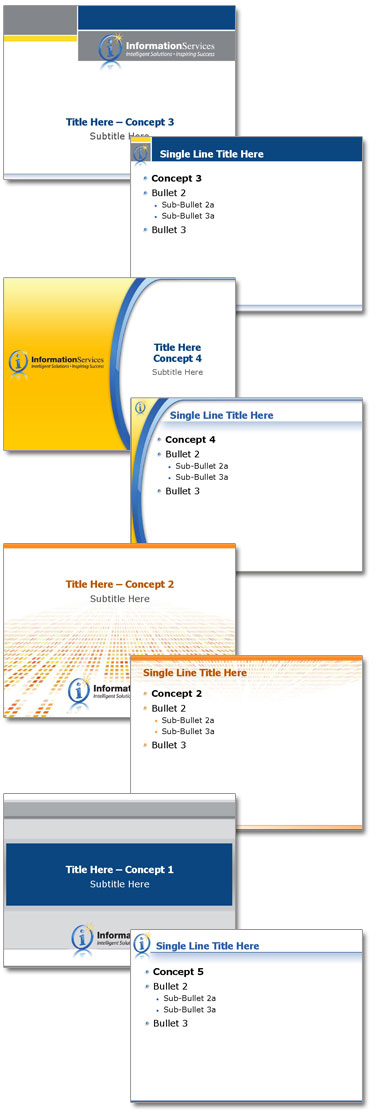
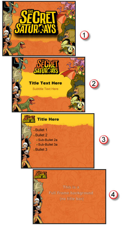
This project was for a university program. They needed a template that integrated their school colors, but was lively-energetic-modern-cool. That was the direction provided and from there I was able to go in any direction. I developed 5 concepts and this was the one selected.

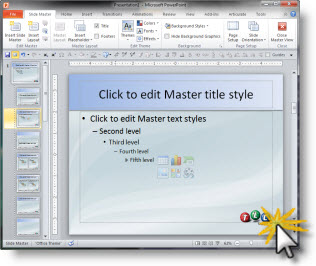
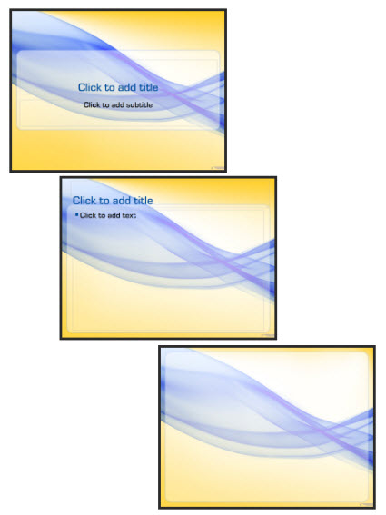
The template also used a custom font, which was installed on all presentation computers vs. embedding in the presentation. It featured 3 master slides:
1. Title slide
2. Content slide
3. Full Frame slide

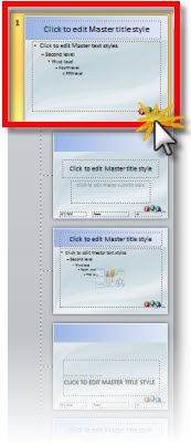
The full frame layout is unique in that generally this style master slide removes the title bar to allow room for images/charts that need the full frame. In this template the title are is actually defined by the absence of the content area. So the Full Frame slide has the content area extended, creating a full canvas for content.

Of course there is a lot of competing visuals with a template like this. The background is full of contrasting, dominant shapes. It has a definite flow that draws the eye across the slide (from left-right). Lots of small text could easily become lost. And this would not be first choice for “standard” corporate template.

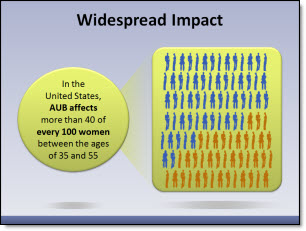
For this project I was provided the full (raw) presentation before any design work began and was able see the type of content. Because the content was large, minimal and to-the-point (eg. no inserted 200 cell excel charts or 20 bulleted lines) I was able to go with a more dominant and visual template design.

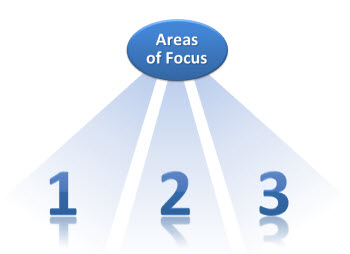
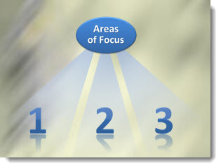
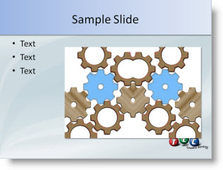
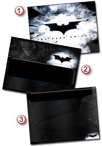
Here are few slides from the presentation:

– Troy @ TLC

By |2016-09-16T11:02:15-07:00February 24th, 2009|Portfolio, Templates/Assets|

Secret Saturdays Template

If you have boy, age 6-12, you a probably familiar with Secret Saturdays. This is a new cartoon series on Cartoon Network and with my 3 girls I was forced to enjoy some research watching several episodes to get in touch with my inner adventurous boy before developing this marketing template.

Working with entertainment properties, especially animated properties, is great. They have all the visual assets needed. And they are all high-res and layered (so no background).

For this project I assembled all of the characters into good and bad. Then selected the most vertical poses and went to work in Photoshop to create my layouts. The key characters (the good guys) are on the left, remain a constant throughout all master slides and positioned just far enough off the slides to not interfer with the content area. The background is a great line drawing the characters overlayed on the primary background color (pulled from the style sheet). And there are 4 master slides:
1. Theme (used at beginning and end of presentations)
2. Title slide
3. Content slide
4. Full Frame slide

Definitely not your standard corporate template – and I bet these presentations are more fun to sit through!

– Troy @ TLC

By |2016-09-16T11:02:43-07:00February 22nd, 2009|Portfolio, Templates/Assets|

Redesign Slide Sample

Here is another sample from a recent presentation. The original slide, show at the top, was difficult to understand and did not convey the needed message. I proposed two layout options to the presenter.

PowerPoint is much more than bulleted text, but even diagrams need to be well thought out and designed to help the presenter convey a message.

– Troy @ TLC

By |2016-11-17T12:22:02-07:00November 7th, 2008|Portfolio|

Dark Knight PPT

I recently had a project with the upcoming Batman movie, The Dark Knight. Had a lot of fun getting sneak peaks at images and footage of the movie. I was tasked with developing a PowerPoint template that carried the dark color scheme and edgyness of the movie. Of course using an all black color pallette is not that easy, but it did prove to be a fun challenge! Here are the 3 slide layouts used for the template:

1. Theme Graphic
2. Title Slide
3. Content Slide

– Troy @ TLC

By |2016-11-17T13:09:20-07:00April 23rd, 2008|Portfolio, PowerPoint|
Go to Top