layout

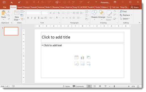
How to Turn Off PowerPoint 2016 Auto Layout Designer

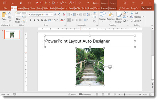
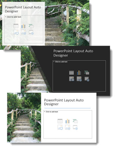
PowerPoint 2016 Auto Layout Designer is a new feature in this version. I wrote a post earlier this month with a review and example. It really is a great feature.

PowerPoint 2016 Auto Layout Designer 1

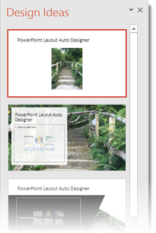
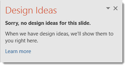
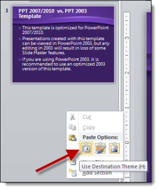
But, if you do not use Microsoft templates (or themes) for your presentations, the Designer tool is not helpful. Using a custom template does not stop Designer from popping open its action pane and offering to help design slides (even though it currently cannot). I have opted to turn off the Designer feature – at least until it has expanded use to work with custom templates.

Here’s how to turn Designer on/off

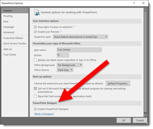
1. Go to FILE > Options > General Tab > PowerPoint Designer

2. Check or Uncheck to turn on or off

3. Click OK

PowerPoint 2016 Auto Layout Designer 2

-Troy @ TLC
By |2016-08-10T08:38:00-07:00February 19th, 2016|PowerPoint|

New Auto Layout Designer

Another new feature of PowerPoint 2016, only available to subscription users, is DESIGNER, which is an automatic layout tool. Here is an example of how it works.

  1. Start with a blank slide – on a Microsoft supplied template (I am using the standard white background new presentation)
    Designer 1
  2. I entered some text in the title placeholder and used the Insert Image option for the content placeholder
    Designer 2
  3. Go to the DESIGN tab and click the new DESIGN IDEAS button
    Designer 3
  4. The right action pane opens the DESIGN IDEAS interface, click LET’S GO
    Designer 4
  5. The Design Ideas pane displays a number of layout options
    Designer 5
  6. Scroll through the options, select any to see and use, these layouts (and several others) were automatically created with a simple click
    Designer 6

Fantastic feature for both the designer and non-designer! But at this stage there are a few downsides to the new DESIGNER tool.

  • The biggest downside is if you do not have PowerPoint 2016, and a subscription version (eg. Office 365), Designer is not available in PowerPoint.
  • The biggest limitation is that it will only work with Microsoft supplied templates. Open the DESIGN tool on a custom template and get the message below.
  • If you do not use layout placeholders (eg. add your own text boxes and insert images not through a placeholder insert image icon), and you get the message below.

Designer 7

Overall, a great idea and smooth implementation. But because TLC virtually never uses a Microsoft template (or theme), this feature has very limited use for us – but I am hopeful Designer will continue to expand its capabilities.


-Troy @ TLC

By |2016-08-10T08:41:53-07:00February 5th, 2016|PowerPoint, Software/Add-Ins|

Design Idea – Group Text Into A Visual Layout

Slide design is usually thought of as making the content professional and visual – which it is. It is also about understanding the message and purpose of the presentation and each slide – something TLC Creative Services enjoys working with clients to uncover. For this slide from a recent project our design team developed a new layout that grouped the paragraphs of text into information chunks, and created a visual styling that coordinates with the clients overall visual branding.

Text-to-visual

This slide is a handout provided to everyone in the training, so large font size was not a primary need. The ability to identify sections of text within the 3 paragraphs was important for the group discussion. Working with the client we identified 5 topics and added subheads to each, then the full text from the provided paragraph. The end result is a slide that would not be ideal if just presented on a screen (too much small text), but a slide that works as a handout and aids the trainers group discussion.


– Troy @ TLC


By |2016-08-10T09:08:54-07:00February 23rd, 2015|Portfolio, PowerPoint|

Thanksgiving 2014 Free PowerPoint Template

Staff designer, Michelle, created this fun Thanksgiving themed template for TLC to post this year. The template is 16×9 and has the full array of PowerPoint options and layouts preset, and this great animated Theme layout.

[KGVID]https://thepowerpointblog.com/wp-content/uploads/2014/11/unnamed-file-3.mp4[/KGVID]

Thanksgiving_Template

Download template: TLC_Thanksgiving_2014_template


– Troy @ TLC

By |2019-10-31T22:20:21-07:00November 24th, 2014|Templates/Assets|

Scorecard Layouts (Portfolio)

For a large conference presentation, the first part of the project was working with the technical specs for a multi-projection screen setup to create the custom slide size to match. For these slides, the page size is 45″x15″ and the presentation screen is almost 60′ wide!

These are layout concepts for one of the topics, a visual scorecard of how a number of programs and projects progressed throughout the year.

The first 2 slides show the 2012 data in vertical and horizontal layouts (it is really great working with content on these super wide screen setups!).

The bottom 3 slides show a variety of visual layouts, different imagery options, but all adhering to the Microsoft Metro styling.

– Troy @ TLC

By |2016-08-10T10:02:16-07:00December 9th, 2013|Portfolio|

Visual Layout for “Business Development” Slide

We strive to minimize bullet lists, simplify text and make presentation content as visual as possible. Of course, the first step is discovering how the presentation will be used (speaker support, knowledge reporting, handouts, etc.). For a recent presentation, there was a lot of data that needed to be included, but the request was to also minimize the use of bullet lists (always a great sign when the presenter understands the need to help the audience capture the slide content!).

For this slide, an overview of the Business Development phases of the company, we minimized the text and categorized it. Then a visual layout was created to clearly show the 3 phases, label the phases and finally add the detail text into each phase. The end result is here, and it was a lot easier for the audience to remember than a slide full of bullets!

– Troy @ TLC

By |2016-08-16T08:58:36-07:00November 10th, 2012|Portfolio|

Things We Do Consistently Well (a Before-and-After example)

Most every presentation software for the past 15 years has made information as bullet points the default way of visually presenting it. While efficient, and duplicate-able, it is definitely not the most attractive or memorable way to present information. Here is an example of “Bullets vs. Visual Layouts” from a recent project.

Here is the original slide – simple, consistent, boring bullet list:

Here is the slide after the presentation makeover project. It has the same information, but has some visual impact with color, shapes, layering, and speaker support animation (obviously not seen in this flat image of the slide):

– Troy @ TLC

By |2016-08-16T09:36:38-07:00January 25th, 2012|Portfolio|

You Can Quote That (a before and after example)

Quotes can be powerful in a presentation. But the visual should also be powerful. Here is the original slide:

On the good side, it is not to small of text, high contrast colors, and legible.

Here is the slide after the presentation makeover:

The quote is now on the (new) corporate template, so it ties in with the full presntation look. It is clearly a quotation with the oversize stylist quote marks. And in addition to credit (name of person being quoted) is a great image of the author.

– Troy @ TLC

By |2016-08-16T09:37:23-07:00January 23rd, 2012|Portfolio|
Go to Top