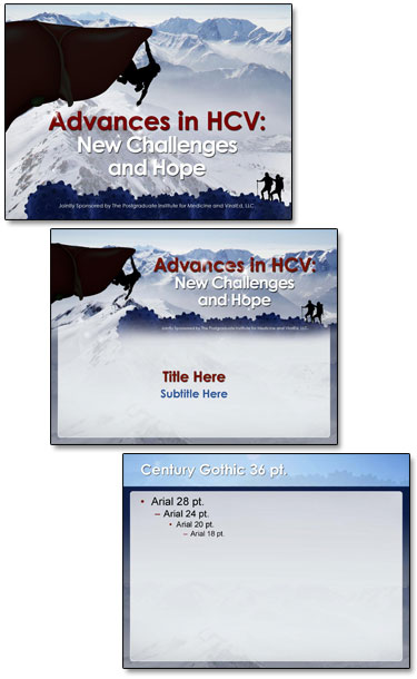
Is that a Liver? PowerPoint Template
As this client proves, medical slides do not need to be the standard boring blue background white and yellow text. The topic is Hepatitis liver function and the challenges in treatment. And we were free to explore visual cues in developing the PowerPoint template. The final approved template used a rock climber facing a challenge, a cliff that is actually the human liver, a hiking ridge made of viruses, a blood red title and a vast open mountainscape for the background.
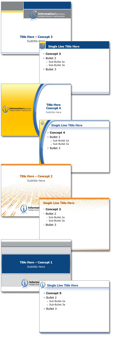
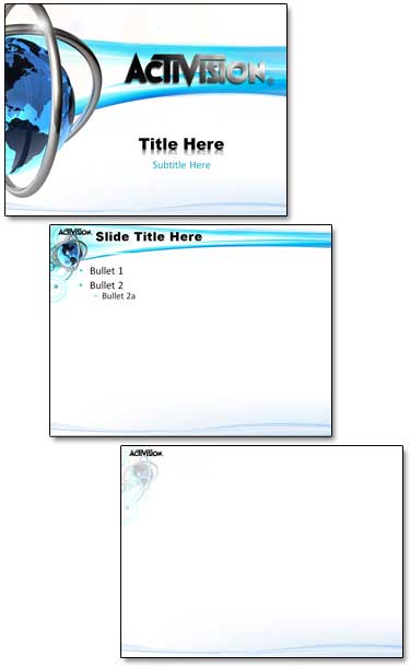
Here is the theme graphic, title slide and general content master layouts.
Here is the theme graphic, title slide and general content master layouts.
-Troy @ TLC