A Campaign Process Everyone Can See (a Before-and-After Example)
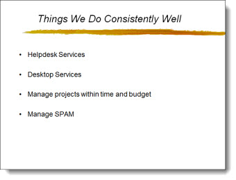
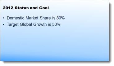
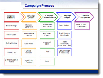
Provided slide had lots of good points: It was not a bulleted list, items are color coded, and alignment is not to off:
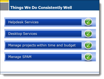
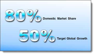
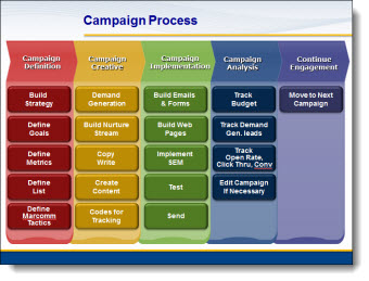
The “after” slide developed used the same layout concept, but used colors for extra contrast, layering of content along with bolder and more legible text:
– Troy @ TLC