design

Slide Design InfoGraphic

In developing our newly designed website, which is finally live, we created some graphics to accent the text. This is one example that TLC staff designer Jennifer developed specific for the website.

Note: This is full of fun, non-sourced, completely made up statistics (okay, they are based on my opinion of the slide design world…). But it is real Infographic design.

– Troy @ TLC

By |2016-08-10T10:23:40-07:00August 21st, 2013|Portfolio|

Infographic on Car Forecast

Here is another example of an infographic TLC developed. The overall goal was to pull the information from a written piece and put it into a visual format.

Truecar.com published new statistics regarding the market share forecast for automotive sales growth over the past year. The story lists the statistics; however, they do it in a way that requires you to read the entire article to understand the numbers. Using the article for our source, we created an infographic and pulled out the key data from the article to create a visual representation of the data. Using icons, bars, and charts the data can be displayed in a variety of ways that are interesting as well as informative.

(infographic of information)

(original written story format)

– Troy @ TLC

By |2016-08-10T10:27:31-07:00July 29th, 2013|Portfolio, Resource/Misc|

Online Shopping Infographic

Infographics are something I like to develop. They are the best of presentation design (visual) and print design, and something you can have a lot of fun designing. InternetRetailer.com recently published a story with statistics from the Global Online Shopper Report based on a March survey of 19,000 consumers in 15 countries. The story lists the more interesting statistics; however, they do it in a boring, non-visual, way. Using the article for our source, we created an infographic that pulled out the key data from the article and Global Online Shopper report to create a visual representation of the data. Using icons, bars and charts, the data is now displayed interestingly and informatively.

(original story)

(story converted to infographic)

– Troy @ TLC

By |2016-08-10T10:27:14-07:00July 24th, 2013|Portfolio|

U.S. Economy Stat Slide

This is a slide developed for a recent executive presentation. The goal for the presentation was speaker support visuals, lots of photos, key message only and viewable as a static image.

– Troy @ TLC

By |2016-08-16T08:55:15-07:00December 7th, 2012|Portfolio|

Global Expansion as a Visual

For this speaker support presentation, the global adoption of the discussed medical procedure was the point being presented. This strong visual was developed (and animated) to show the global reach of the procedure.

– Troy @ TLC

By |2016-08-16T08:58:18-07:00November 12th, 2012|Portfolio|

Visual Layout for “Business Development” Slide

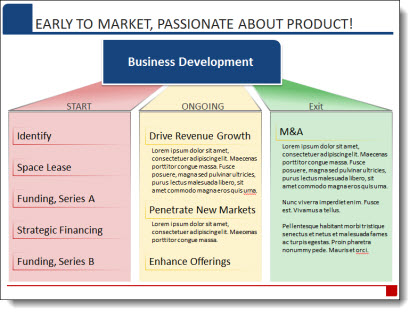
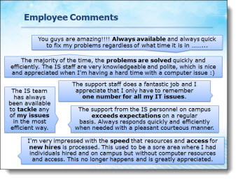
We strive to minimize bullet lists, simplify text and make presentation content as visual as possible. Of course, the first step is discovering how the presentation will be used (speaker support, knowledge reporting, handouts, etc.). For a recent presentation, there was a lot of data that needed to be included, but the request was to also minimize the use of bullet lists (always a great sign when the presenter understands the need to help the audience capture the slide content!).

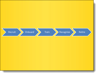
For this slide, an overview of the Business Development phases of the company, we minimized the text and categorized it. Then a visual layout was created to clearly show the 3 phases, label the phases and finally add the detail text into each phase. The end result is here, and it was a lot easier for the audience to remember than a slide full of bullets!

– Troy @ TLC

By |2016-08-16T08:58:36-07:00November 10th, 2012|Portfolio|

Quotes Should Not Be Bullets (A Before-and-After Example)

The supplied slide had plenty of great callouts end users, but in a bullet list it looks just like any other (boring) slide.

Taking a cue from IM (Instant Messaging) applications, each quote was put into a speech bubbles for a lively and visual slide layout. The key messaging of each is also bolded text to direct the audience.

– Troy @ TLC

By |2016-08-16T09:34:09-07:00February 8th, 2012|Portfolio|

Technology That is Not Clear (A Before-and-After Example)

This a slide from a presentation makeover project. The original slide was typical in that had some photos, screen captures and bulleted list text. The overall design was clean and (overly) compartmentalized the content.

The makeover used the same images, bullet list text and focused on grouping content. In the final slide layout, it is much easier to quickly identify the 3 topics and the bullet lists are easier to read with improved line spacing and alignment.

– Troy @ TLC

By |2016-08-16T09:34:28-07:00February 6th, 2012|Portfolio|

The Timeline Road (A Before and After Slide)

As part of the presentation makeover, I wanted to take this process, that was central to an entire section of the presentation, and create a layout that visually supported the presenter’s talk and was more engaging to the audience.

The core message was the process of engaging with a brand over many stages. The visual layout creates a road with the stages along it. Each stage is highlighted with supporting graphics.

– Troy @ TLC

By |2016-08-16T09:34:51-07:00February 4th, 2012|Portfolio|
Go to Top