design

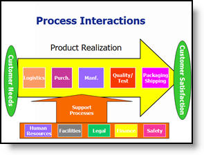
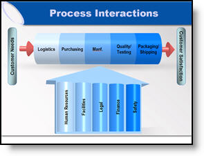
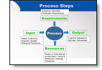
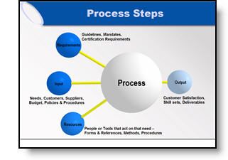
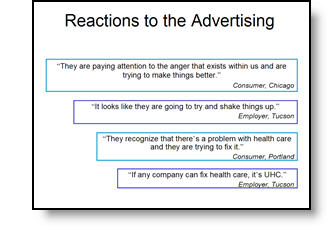
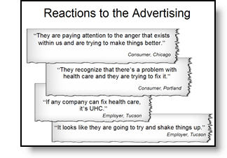
Align, Equal Size and Balance

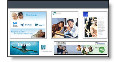
On this slide the elements where nice high-resolution images. But they blend together and do not have a strong sense of balance.

The presentation I was working on involved converting all to a 16×9, widescreen, format. Having the extra space was great for this slide, allowing me to keep the images large. From a design perspective each had a black stroke applied to keep it from blending into the background, they were made equal size with the other elements on its row, the left and right elements were aligned with one another and all were equally distributed (horizontally). The overall goal was to help the images stand out as individual elements and be presented in a visually balanced layout – here is the slide developed:

– Troy @ TLC

By |2016-11-17T15:46:35-07:00March 9th, 2007|Portfolio|

Oh ,The Colors

It is often beneficial to color code the data. But sometimes to much color makes things difficult to interpret and ends up looking like the circus has arrived. Here is a great diagram that provides a lot of vital information – it just gets lost in all of the colors and shapes.

My goal was to minimize the distracting colors, make the diagram fit within the slide and emphasis the relation and process. Here is the revised diagram:

– Troy @ TLC

By |2016-11-17T15:46:07-07:00March 7th, 2007|Portfolio, Tutorial|

Great Graphic – For an Engineer

Here is the original graphic provided. It has all the needed information, is nicely balanced, has good contrast – and has all the factors an engineer would appreciate.

Taking the same content, basic layout, and even color scheme, here the revised version of the diagram developed for the (16×9, widescreen) presentation.

– Troy @ TLC

By |2016-11-17T15:45:31-07:00March 5th, 2007|Portfolio, Tutorial|

Accurate Graphic, But Wrong Emphasis

Here the original graphic from a presentation. It is a universal company-wide depiction of their process. No problem, I initially recreated the graphic using the 3D spheres for a more professional look.

But listening to the presenter during rehearsals he was discussing how three elements drive the final element (output). We adjusted the graphic for this presentation to be in line with the message being discussed.

– Troy @ TLC

By |2016-11-17T15:44:31-07:00March 3rd, 2007|Portfolio|

Show It A Story

Lots of presentations show quotations. Here is the original slide with a lot of quotes – each animates on with a click.

To put the quotes in a visual environment a series of ‘torn paper’ graphics where designed, font sizing and line spacing were also adjusted.

– Troy @ TLC

By |2016-11-17T15:44:00-07:00March 1st, 2007|Portfolio, Tutorial|

Tell the Right Story

Here is the graphic from an original slide.

After discussing with the presenter, the message was not really about a hierarchy, but that all three processes where controlled by one business unit. Here is the revised graphic that was more aesthetic, cooridinated with the presentation color scheme, and showed a more accurate story.

– Troy @ TLC

By |2016-11-17T15:43:22-07:00February 27th, 2007|Portfolio, Tutorial|

Access to PowerPoint

After I have interpretted what the data is saying (relative to content of industry and presentation), the need is to often recreate in a PowerPoint-friendly format. Here is the original provided, an MS Access piece.

To make a clearer, easier to read, symmetrical and more aesthetic graphic here the same data recreated using semi-transparent autoshapes, color coordinated arrows and a layout that was as large as the template permitted.

– Troy @ TLC

By |2016-11-17T15:42:58-07:00February 25th, 2007|Portfolio|

PPT Requires A Lot of PSD

Here is just the title slide to a very visually stunning presentation Lori recently developed for a client (maybe later I will upload some of the highly stylized content slides).

The key with this entire project, is that the amount of time spent in Photoshop was more than double the amount of time spent working in PowerPoint. Here are the layers created in Photoshop to end up with the above template background (and this one is pretty straight forward/easy in the number of layers and effects).

– Troy @ TLC

By |2016-11-17T15:34:39-07:00January 30th, 2007|Portfolio|

From This To That (Technical Architecture Slide)

With a recent project I began to feel that part of my duties were interpreter. All the information was there, but I did not have the presenter available to explain the industry and what the message of the slide was. All is done and very well received, but thought I would share a some before-and-after slides.

Before:
Lots of information, sort of compartmentalized, lots of colors, lots of confusion and of course, clip art.

After:
Took a while to figure out the message, then recreate with a new layout that allows everyone to see the interaction of the elements, a more limited color palette and no more stock clip art.

– Troy @ TLC

By |2016-11-17T15:33:57-07:00January 28th, 2007|Portfolio|

Side-by-Side Example (with and without cast shadow)

I pulled the images from a recent presentation to show a nifty side-by-side comparison of the same slide with and without some cast shadow elements. This first slide shows all of the photos inserted – because I have dropped out the background around each image and saved as a .png the slide looks nice and clean.

Here is the same image with an oval cast shadow under each element. The cast shadow helps add depth to the slide and make the images pop from the background.

In addition the slide had a dramatic animated entrance, which was accented even more by animating on the cast shadows.

Click here to view movie.

– Troy @ TLC

By |2016-11-17T15:30:38-07:00January 14th, 2007|Portfolio|
Go to Top