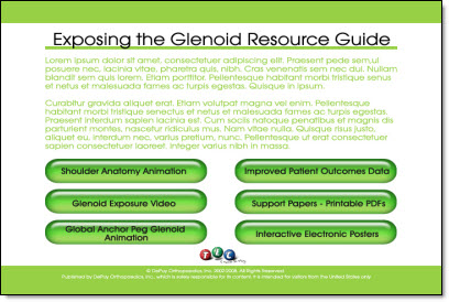
design

Print – 1 Sheet

I did a series of print design projects and this is one piece from them. Working from a hand drawn diagram I recreated the flowchart and content in the coordinated colors and design scheme.

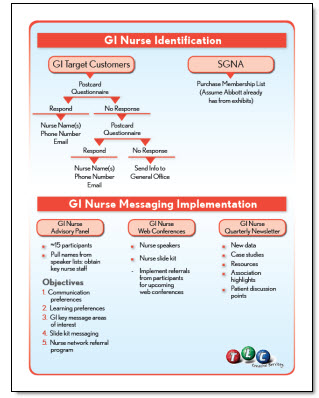
This is a standard US Letter size piece that was supplied to the client as a print-ready PDF that could be used on the local color printer or sent to a print shop for large volume printing, all from the same file as there is no ‘bleed’ (color extending to the edge), which was a purposeful element of the overall design.

– Troy @ TLC

By |2016-09-16T11:03:56-07:00February 20th, 2009|Portfolio|

Another Template

Here is the title slide from a recent PowerPoint template project. This one was great, because after it was approved the same design was then applied to other departments/divisions each disquinshed by having their own color scheme (eg. blue, tan, yellow tinting vs. the green tinting in this one).

For the project I was supplied with some great Disney art elements such as the Disney logo and the stars which I turned into a star trail that framed the text area and added a feeling of motion.

– Troy @ TLC

By |2016-09-16T11:04:16-07:00February 18th, 2009|Portfolio, Templates/Assets|

PPT Reflection Example

This is just 2 quick slides from a recent project, that were actually supplied to client before the real production began. The request was what could be done with all of the supplied images to give them a professional and consistent appearance.

I took this supplied image and first removed the background. I worked in Photoshop to do this. PPTs eyedropper would be an option, but it would remove any of the white inside the towers, which would really affect the right one. In Photoshop with the background removed it was saved out as a .png with transparency. The reflection was applied in PPT 2007.

I also grouped in another image (far right) to show how multiple images could easily be added to the layout, which was not an option with the opaque background on the originals.

Client liked the overall effect, approved it and then I got to work on slides and the other 30-40 images…

– Troy @ TLC

By |2016-09-16T11:04:36-07:00February 16th, 2009|Portfolio|

CD Label Art

Many projects need to have multiple items all coordinate. Here is the CD label from a multimedia project that I used the same visual elements and layout style for a Launcher Application, video lecture series and this CD label.

This is the client proof which shows the center of the CD and a keyline around the actual circumfrence. The graphics extend beyond the actual CD size to give the printing process ‘bleed’ just in case the printing is not perfectly centered. The final print-ready file that goes to the printer does not include either of the black overlays.

– Troy @ TLC

By |2016-09-16T11:06:40-07:00February 8th, 2009|Portfolio|

Event Program Cover

This was a fun, and personal, project. My oldest daughter joined a swim team last year. Her team hosted the fist swim meet of the year (12 other swim teams attended with over 500 registrations!). I was asked to help design the cover for the program – which I of course said yes to!

– Troy @ TLC

By |2016-09-16T11:07:47-07:00February 6th, 2009|Portfolio|

DVD Menu

Well I have been asked several times in the past few weeks what I have been working on, for examples of projects and if I really do anything… Hmmm, the website is a bit out dated and the blog has lots of tutorials but few samples. I can see where these statements are coming from as there is little current online proof that I really do work on lots of projects.

So most of this month will be dedicated to showing some examples of recent projects (at least the ones I can, as many are under NDA – and where needed I will substitute the TLC logo in place of company/event logos).

To kick things off – here is a DVD menu layout designed for a recent project (yes that’s greeking text to protect the innocent – me).

– Troy @ TLC

By |2016-09-16T11:08:33-07:00February 2nd, 2009|Portfolio|

Making a Visual (Scoreboard)

Working on a recent project I thought this was a good example of the progression of a slide. The original speaker notes called for a slide that basically said they are ahead of the competition. Here is the slide they came up with:

During a slide review we moved to making this in to a visual that the speaker could use for an analogy. A football scoreboard was the solution. Here is what they came up with (‘they’ being the clients internal staff).

When I received the presentation to go through and clean up all slides here is the visual developed:

– All of numbers on the scoreboard were PPT WordArt (using PPT 2003) overlaid, so client can easily change to match analogy.
– Top of scoreboard was branded with client name (here I branded with TLC Creative)
– Hard to see here, but even the mascott is branded with the company initials on his hat (with TLC here)

The final slide ended up being animated with the numbers on the scoreboard (quater, score, time remaining until new product launch, etc.) changing as a quick history/timeline was presented!

– Troy @ TLC

By |2016-11-17T12:16:06-07:00December 11th, 2008|Portfolio|

Make It Small(er)

I often see “Continued” or “More” in slide titles to indicate the slide contains a continuation of information from the previous slide. So the title looks like this:

But the “(CONT)” is not part of the topic and is distracting to the title. It takes more effort, but I recommend manually adjusting the font size of this special set of information to not be as distracting and to help provide a hierarchy of information. The adjusted text looks like this:

– Troy @ TLC

By |2016-11-17T12:21:38-07:00November 11th, 2008|Tutorial|

Redesign Slide Sample

Here is another sample from a recent presentation. The original slide, show at the top, was difficult to understand and did not convey the needed message. I proposed two layout options to the presenter.

PowerPoint is much more than bulleted text, but even diagrams need to be well thought out and designed to help the presenter convey a message.

– Troy @ TLC

By |2016-11-17T12:22:02-07:00November 7th, 2008|Portfolio|

Custom Chart Sample

From yesterday’s post here is the real purpose of keeping a hidden backup. I saved out the chart as a .png image. Opened it in Photoshop, used the bars for reference to create a cut out line for the image. Then saved the new ‘chart’ out as a .png image and placed on the slide.

– Troy @ TLC

By |2016-11-17T12:22:24-07:00November 5th, 2008|Portfolio|
Go to Top