design

Modern Design in 2017

My fellow Microsoft MVP and presentation trainer, Ellen Finkelstein made a post entitled “10 Tips for Modern Design in 2017” (see post here). She then organized a blog roundup on the same topic.

modern design in 2017

Here is the TLC Creative Services list of Modern Design Trends we see for 2017:
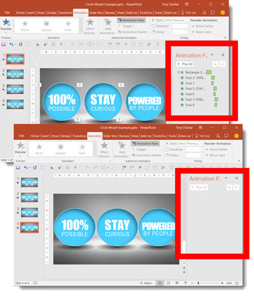
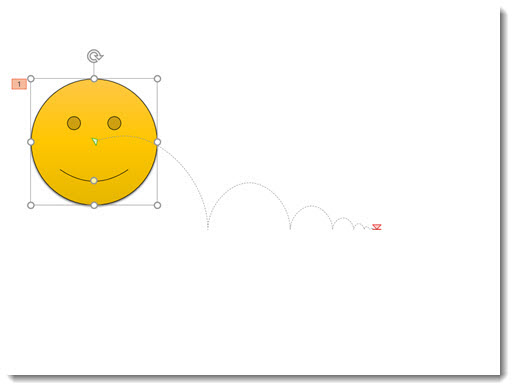
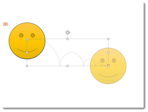
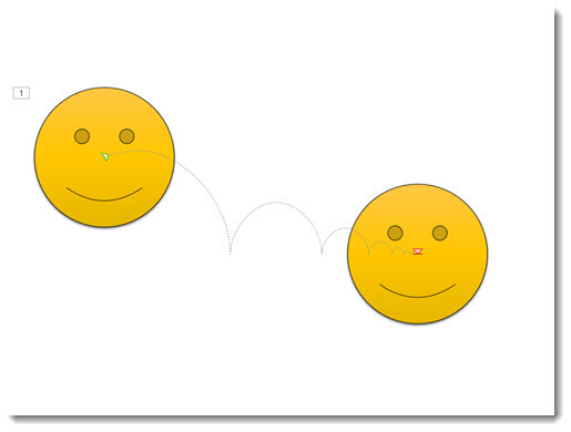
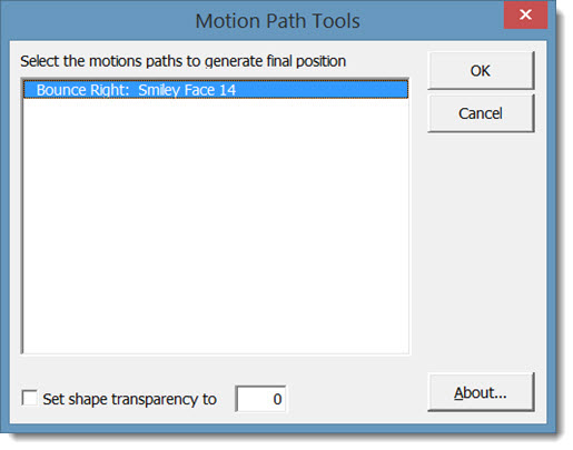
  • More Motion:

    Morph has simplified adding complex animation to presentations and allowed a greater number of users to now add motion to their slides without investing hours into a single slide.

  • Color Blocks:

     We see a merging of flat design (no bevel, reflection, etc.) and a move away from textures and gradients to the use of large color blocks as the accent graphics and layout framing devices.

  • More Visual Layouts

    Even if not used, the addition of Designer in PowerPoint (see post here for review), is raising awareness of how slide layouts can be improved over simple (and often boring) bullet lists. For years, TLC Creative has developed what we call “Visual Layouts” for bullet list slides, and we are excited to see more awareness and requests for more professional slide designs in 2017.

  • More Navigation:

    PowerPoint has always had Custom Shows, but they are tedious to setup. With the addition of Zoom, setting up elegant non-linear navigation is much cleaner and intuitive.

  • Better Organization:

    Sections have been available sense PowerPoint 2010, but only recently have we seen more presentations leveraging the Sections tool. The small feature improvements, such as ability to copy a Section and its slides to another presentation, are making Sections a more powerful and flexible tool to use.

  • More Vector:

    Vector graphics, those that can be resized without quality loss and modified using PowerPoint’s fill-outline-styling tools, will get a huge boost with the new .SVG file format support (look for a full blog post series on SVG later this month!).

– Troy @ TLC

By |2016-12-23T10:14:45-07:00December 23rd, 2016|Resource/Misc|

Slide Design Using Images and Illustrations

Just a quick slide from a recent project that I thought was pretty cool.

Slide Design Using Images and illustrations 1

Throughout this presentation, we used a layered visual styling of photo images as the base and animated vector illustrations that interacted with the photo. Rather than list the 4-5 talking points about CO2 emissions from vehicles, we visually represented vehicles with a huge tail pipe. Then, to visually support the talking points, the CO2 icon was introduced, followed by the gasoline icon, which supported the talking point about gasoline powered engines with another vector overlay (the story there was how much better gasoline has become over the decades, in terms of CO2 emissions, but that it still creates them).

Overall, the slide design using images and illustrations allowed for a presentation that was visually creative with a unique style and a happy presenter.

-Troy @ TLC

By |2016-10-10T10:55:47-07:00October 12th, 2016|Portfolio|

PowerPuff Fun! A PowerPoint Template

Yes, even cartoons need a reboot to make them work with the next generation of kids. The TLC Creative design team had a ton of fun developing a series of marketing presentation template concepts (the client selected shown here). Just another day in the design studio!

PowerPuff_Concept1

For the TLC Design Team, slide design must maximize usable content area, PowerPoint preset options, and lots of creativity. Creativity such as how to use the provided art elements and creating layouts, color schemes and animation to present dynamic and engaging presentations vs. presentations that have a nice background but are otherwise boring.

Note: This project was developed for a specific client, using licensed art, so we are sorry, but it is not available for download.

-Troy @ TLC

By |2016-09-18T16:38:50-07:00September 28th, 2016|Templates/Assets|

PowerPoint Layer Order Explained

How do you describe what is on top or bottom for slide content?

Z-ORDER_5

Let’s look at a simple explanation of 2D design. With presentation design, this is very easy to visualize by looking at a chart. A standard bar chart has two axes: left-right (X) and up-down (Y).

Z-ORDER_7

To expand on things, here is a simple explanation of 3D design. In 3D design, there are 3 axes; left-right (X), up-down (Y) and front-back (Z).

Z-ORDER_6

Similarly, PowerPoint slides can have 3 axes for content. Slide content is 2D, which is left-right and up-down. But, it can also be layered on top of each other, which is the Z-axis. So, content that is layered on top of each other is referred to as the “Z Order.” Here is an exploded view of a slide. The Z-order has the text on top, so no other slide content is going to block it – but the text may overlap other content.

Z-Order 02

Z-order is adjusted with PowerPoint’s ARRANGE > ORDER OBJECTS tools. These are the “bring to front” and “send to back” buttons. The SELECTION PANE shows all slide objects in their Z-order with items at the top of the list on top and items lower on the list having the other items on top of them.

Note: PowerPoint cannot have objects on the same layer, so as soon as there is 1 object on a slide, something is always layered on top.

Z-Order 4

-Troy @ TLC

By |2016-08-31T10:09:54-07:00September 8th, 2016|PowerPoint, Tutorial|

Blogs Infographic

Every now and then, I find something that is worth sharing. This infographic is not only well designed (lots of good ideas for iconography and layouts for presentations), but has lots of great information about coordinating and adding posts to a blog.


Check out this infographic at webmag.co “70 Tips to Boost Your Blog” and be inspired.


Boost your blog

– Troy @ TLC

By |2016-08-19T09:28:31-07:00August 19th, 2016|Resource/Misc|

PowerPoint Content vs. Picture Placeholders

Inserting an image using the preset Picture Placeholders seems like a super shortcut, until things get frustrating with why images do not insert the same way every time a Picture Placeholder is used. The reason, almost always, is knowing there are two types of Placeholders – and each handles images differently.

Here is an explanation and example using a Content Placeholder vs. Picture Placeholder – and as a side note, neither option works the way I feel it really should…

CONTENT PLACEHOLDER

Inserting an image in the Content placeholder, identified by this icon, offers the option of inserting various elements: Tables, Charts, Smart Art, Video, and Images.

Insert Content icons

Inserting an image in the Content placeholder adjusts the layout to the size of the actual image. If you insert a small image, the placeholder shrinks to the small size image. If you insert a large image, the image will at maximum be the size of the slide and the placeholder will grow to that size. The downside is the preset position and size on the master layout is ignored and the slide content needs to be manually repositioned and sized.

Content placeholders


PICTURE PLACEHOLDER

Inserting an image in the Picture placeholder adjusts image to fill the size of the layout. The downside here is the image is often cut off and needs to be repositioned and resized using the Crop tool.

Picture placeholders


While both Placeholder options are pro’s and con’s, at least now you have an idea of what PowerPoint is doing and what to expect.


-Troy @ TLC

By |2016-08-09T18:15:45-07:00August 15th, 2016|Tutorial|

Using Morph for Animations

The PowerPoint Morph transition is PowerPoint’s best new animation feature!

using morph for animations

We have been leveraging the fantastic new transition in lots of presentation projects since its release, including using Morph for animations. Here is another example where we used Morph as the animation effect. Our client wanted to show the above three statements. The real request was to emphasize each as they were addressed. Our first step was to convert the provided bullet list into a dynamic visual; the end result was the above slide.

For the “emphasize each” request, using the Morph transition as our animation, we created a dynamic “flip” animation effect. It also was something that did not look like “PowerPoint.” Below is a video of the final animation effect:

[KGVID]https://thepowerpointblog.com/wp-content/uploads/2016/08/unnamed-file.mp4[/KGVID]

  • After the slide layout was approved, we duplicated the slide 3X.
  • On the first slide, we added the animated entrance effect for the 3 circles and text.
  • On the second, third and fourth slides, we simply horizontally flipped each circle. No animation on these slides. The Morph transition created the nice twirl, or flip, animation.
  • Done!

using morph for animations


– Troy @ TLC

By |2019-10-28T09:57:42-07:00August 5th, 2016|Portfolio, PowerPoint, Tutorial|

Probiotics Slide Makeover

This is a slide makeover from a recent presentation design project. For the project, we discussed the styling, end use, presenter style and content with our client. After developing a custom PowerPoint template, visual styling rules, and then a speaker support presentation based on the provided presenter script.

Slide makeover

Not only did we learn a lot about Probiotics, but we developed slides like this that simplified 4 paragraphs of text into a clear visual message.

-Troy @ TLC

By |2016-08-08T10:23:38-07:00August 3rd, 2016|Portfolio|

Motion Path Tool PowerPoint Add-in

Shyam Pillai is an incredibly talented and knowledgeable coder. Fortunately for everyone that uses PowerPoint, he has shared some of his expertise by releasing a number of incredible add-ins over the years. If you use Motion Paths in PowerPoint, this FREE add-in is a must have.

The Motion Path Tools add-in shows up in its own tab called “Tools.” When you have a Motion Path applied to an object, this add-in will copy the object and place the copy at the end position of the path. This is very helpful for lots of animation and layout needs – and can save lots of time!

The add-in is found on a new TOOLS tab (where the developer has most of his add-ins install too).

Motion-Path-1

Here is a quick example slide with a motion path applied to the shape.

Motion-Path-2

Starting with PowerPoint 2013, clicking on the shape while in the animation tab displays a ghosted version of the shape where the Motion Path ends – a very helpful improvement to PowerPoint!

Motion-Path-3

But in this example, what we really need is a copy of the shape in that end position.

  • Select the shape
  • Go to TOOLS > END POSITION

Motion-Path-4

  • In the Motion Path Tools dialog, select the path you want to copy (this is pretty nifty because if you have multiple paths on a slide, they will all be listed here).

Motion-Path-5

  • Click OK and the add-in instantly copies the original shape (or photo or anything the motion path is applied to) and places the copy at the end point of the path!

The most common design task is to copy that new shape, delete it from that slide, and paste it onto the next slide. Now the Motion Path animation happens, go to the next slide and the shape is seamlessly in the same place!

Get more details and download (this amazing add-in is FREE) here.


– Troy @ TLC

By |2016-08-10T08:01:19-07:00June 22nd, 2016|Software/Add-Ins|
Go to Top