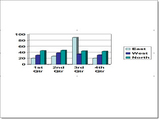
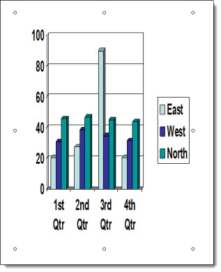
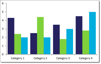
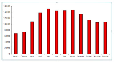
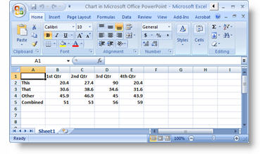
charts

Nice Bar Chart

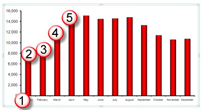
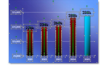
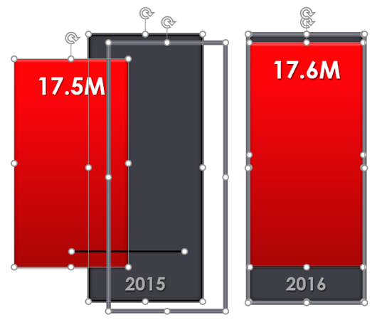
Often we create our own charts, not from the charting engine, but from shapes, text, and graphics. Of course, this is for highly visual presentations that we know are not going to rely on charts with data and can be adjusted for use in other presentations. So, this is as much about animation as slide content styling. Before the animation example, I want to show the design for the nice bar chart. Each bar is comprised of 4 graphic elements: red box with text top aligned, grey box with text bottom aligned, grey outline (no fill box), and a black line.

 nice bar chart

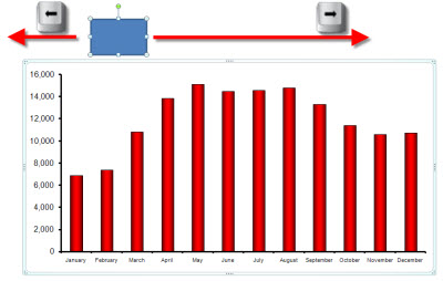
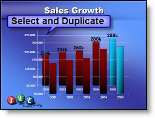
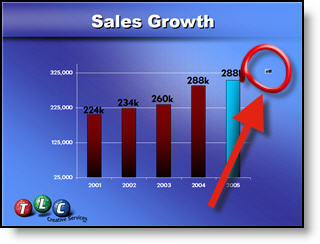
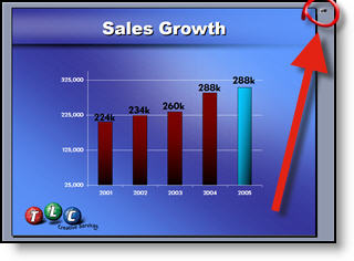
Here are the animated bar charts (sample video has 2 slides with visual bar charts, client content removed, and for example here only).

[KGVID]https://thepowerpointblog.com/wp-content/uploads/2018/05/unnamed-file-5.mp4[/KGVID]

Troy @ TLC

By |2019-10-30T06:00:52-07:00May 21st, 2018|PowerPoint|

New Chart Types in Powerpoint 2016

How to insert New Chart Types in Powerpoint 2016

New Chart Types in Powerpoint 2016 for subscription users of Office 365 are being automatically added to your app (Note: This is only in subscription users of Office 365, PowerPoint 2016, and I have only looked at the Windows version).

There is bigger news than just some new styles. Microsoft is moving all charting to a new charting engine, and these new charts are coded with this new engine. Eventually, all legacy charts will be ported to the new charting engine, and, fortunately, this is still an in-process engine development (I am certain everyone will encounter a chart limitation depending on their chart data and the way they create charts) – so my take on things is “Yay new charts! But the new charting engine is not fully functional, so some options in the new charts are not fully functional yet.”

The good news is even though only subscription users can create these charts, all versions of Powerpoint (dating back to 2010 and Mac versions) can display chart types – editing and animation is somewhat limited when using previous versions…

Here are 4 of the new chart types currently available (we will continue to see more chart variations added over time, look for another new chart type in the February updates).

Follow these Steps:

Go to INSERT > CHART

New Chart Types in Powerpoint 2016


The Column Bar Chart

A standard Chart.

New Chart Types in Powerpoint 2016

1. Radar Chart

That same data in the Bar Chart can instantly be updated.


New Chart Types in Powerpoint 2016

2. Sunburst Chart

This a great addition to the native PowerPoint chart options vs. going to external charting apps to develop.


New Chart Types in Powerpoint 2016

3. Treemap Chart

This Chart is new to PowerPoint 2016 native chart options.

New Chart Types in Powerpoint 2016

4. Waterfall Chart

This standard Column chart with negative data.

New Chart Types in Powerpoint 2016


-Troy @ TLC

By |2016-08-10T08:38:26-07:00February 17th, 2016|PowerPoint|

The Pyramid Pie Chart

A few weeks ago, at The Presentation Summit in New Orleans, I was happily a part of the audience listening to Nigel Holmes give the opening General Session talk. Nigel is British, funny (in a British way), memorable (especially the vibrant blue rimmed glasses) and amazingly observant. In talking with Nigel later, he made it very clear that he is not claiming the below pie chart graphic as his, but I am giving him all the credit for weaving it into his talk since it was the first time I have seen it.

Nigel_Holmes

One of the TLC Creative designers recreated this amazing 3D perspective pie chart (from a photo I took of Nigel’s presentation) and it still makes me smile!

Pyramid_PieChart

Feel free to download the TLC Creative version of this slide Here.

– Troy @ TLC

By |2016-08-10T08:51:42-07:00October 14th, 2015|Personal, PowerPoint|

Auto Scaling Charts and Font Issues

Sometimes features go missing in newer versions of software. In PowerPoint, the “AUTO SCALE” feature for chart text disappeared after PPT 2003.

Charts in PPT 2003 have an Auto Scale font feature for chart axis’ (checked on by default) that allows the font to scale to the chart when the chart is resized.

The font stays in scale to the chart when the chart is enlarged or reduced in size.

Charts in PPT 2010 do not have the auto scale font feature. When the charts are resized, the fonts stay the same size and get cut off or removed. You have to select the axis and increase or decrease the font manually.

In PPT 2003, however, when the lock aspect ratio for the chart is turned off, and the chart is stretched, the chart becomes distorted.

But in PPT 2010, when the charts are stretched horizontally or vertically, they do not distort.

AUTO SCALE, we miss you!

– Troy @ TLC

By |2016-08-16T09:02:23-07:00October 19th, 2012|PowerPoint, Resource/Misc|

Help – This Shape is Stuck in the Chart

There is a good reason for this feature, but for most it seems to be bug. Which is it, depends on your preference.

Here is the scenario. A chart is on a slide:

With the chart selected, you decide to add a callout box to highlight the import data point in the cart.

The new shape is inserted, but within the chart boundaries. Note: The chart is still selected while the shape is selected.

The new callout shape can be edited and moved – but it can only move within the chart boundaries.

The newly inserted shape has become part of the chart. If the chart is moved, the shape moves. If the chart is deleted, the shape is deleted. But the shape does not interact with the chart, the chart styling options do not change the new shape, and the chart animations do not animate the new shape. For some, this is a feature (ability to tie new shapes to a chart). For others, it is a bug (they did not want the shape tied to the chart).

If you want the shape outside of the chart, the easiest fix is to select the shape (select the chart, then select the shape in the chart) >> copy >> delete >> unselect the chart >> paste.

Now the slide has a chart and a separate shape.

– Troy @ TLC

By |2016-08-16T09:07:54-07:00September 19th, 2012|PowerPoint, Tutorial|

PPT 2013 – Datasheet is Back!

I admit, I am not a number person. That also means I am not an Excel person. So when PPT 2007 came out and the simple Datasheet editing of chart data was replaced with a full Excel experience, I was not the happiest designer in the building. Of course, in the long run, it has forced me to face Excel much more and become much more proficient with it.

Now, with PPT 2013, it the best of the old and new! Insert or edit a chart and PowerPoint offers the nice, simple and easy to use Datasheet.

But this is not the Datasheet of old. It is more like Excel Lite, as it is not an independent application like the legacy version, but a simplified Excel editing window. So, if you love Excel, or need more functions than the Datasheet offers, just click the Excel icon.

Now the chart data is being edited in the full Excel experience.

– Troy @ TLC

By |2016-08-16T09:12:38-07:00August 24th, 2012|PowerPoint|

Move a PPT 2007 Chart

Here is my PPT 2007 slide with a nice stylized chart:

The frustration is when you want to nudge the chart into position using the arrow keys it does not move… Each click of the arrow key just changes the selected item within the chart:

My solution is this – a standard autoshape box:

When you select a chart in PPT 2007 AND any other object, the focus is now on the group of items, not the individual chart. So using the arrow keys moves both items.

Move the chart into position, then delete the temporary box. Done.

– Troy @ TLC

By |2016-09-16T10:40:05-07:00April 2nd, 2009|Tutorial|

Custom Chart Sample

From yesterday’s post here is the real purpose of keeping a hidden backup. I saved out the chart as a .png image. Opened it in Photoshop, used the bars for reference to create a cut out line for the image. Then saved the new ‘chart’ out as a .png image and placed on the slide.

– Troy @ TLC

By |2016-11-17T12:22:24-07:00November 5th, 2008|Portfolio|

Before Ungrouping Chart – Make a Hidden Backup

For many projects I find myself ungrouping charts for custom animation or any number of other reasons. But what often happens is there is need to adjust the chart… oops it is now 50+ individual text boxes and autoshapes.

My solution is before I break apart a chart is to create a duplicate it.

Then shrink the duplicate to a miniature size.

I then move the miniture version off the slide so it is not seen during a slide show (or I have also ‘hidden’ it under another graphic).

Now I can ungroup the chart on the slide and do whatever the special needs are – and still have a backup option should the data need to be adusted.

– Troy @ TLC

By |2016-11-17T12:22:53-07:00November 3rd, 2008|Tutorial|

PPT 2007 Charts (part 6)

No more importing an Excel chart and not having it play nice with PowerPoint. All of Offices uses a single charting engine, so a chart can be designed in Excel, Word or PowerPoint and be used (and edited) in all three with no issues.

When you go to format a “PowerPoint” chart is now opens an excel window with the data. Here is the data used to create the sample chart for this series.

– Troy @ TLC

By |2016-11-17T13:19:12-07:00March 21st, 2008|PowerPoint, Tutorial|
Go to Top