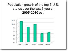
I needed a slide that showed the 5 states with the most population growth over the past 5 years. The original slide had a standard bar chart, which told the statistics but was not very compelling.
I recreated this slide with a map of the U.S. highlighting the top 5 states. I used the 3D tools in PowerPoint to make the states ‘pop’ out of the map and applied a custom gradient fill to each. I also applied a 3D rotation to the state name and percentage text with a white glow to allow the text to be easy to read.

Note: all data in these slides is sample data (eg. I made it up, while I waiting for real data from the client).
– Troy @ TLC