Here is a graphic supplied by the client for a recent presentation design project . Quick – what is wrong?
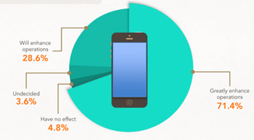
In developing ideas for a new way to show this information we noted the pie chart numbers add up to greater than 100% (108.4%). We let our client know of this and received a great soundbyte “Wow, you guys actually look at the content you are working with!”
Yes, TLC is very picky about the aesthetics (color scheme, alignment, consistency) AND the message.
– Troy @ TLC