Housekeeping Slide of Icons
“Housekeeping” slides are a standard for many large events. The info and content varies, from location of restroom to silence your mobile device. From a recent meeting I liked this icon driven style for the housekeeping slide (vs. bullet list of text).
![]()
Troy @ TLC
Dr. Carmen Simon on The Presentation Podcast!
Don’t miss episode 187 of The Presentation Podcast for a conversation with Dr. Carmen Simon on how presentation information is retained by attendees!
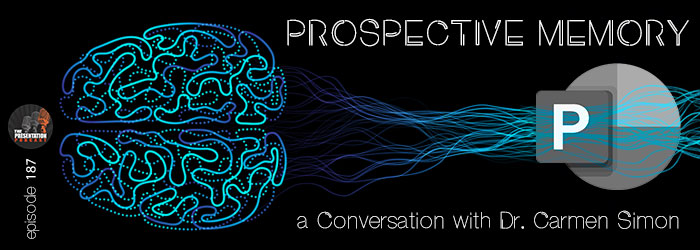
There is a science to the art of presentation design. Troy, Nolan and Sandy talk with Cognitive neuroscientist Dr. Carmen Simon about presentation information retention and her latest study findings. Listen here!
The Presentation Podcast in the Top 100!
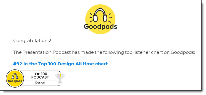
As we look to the end of 2023, an email like this is really nice . The Presentation Podcast earns a badge on Goodpods for being in the top 100 of all Design podcasts!
Troy @ TLC
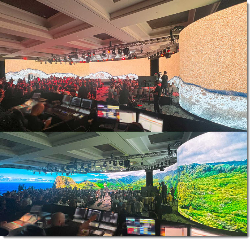
Lots of BIG LED Walls
Ending the month with a few photos of an amazing event I was part of last month. All content has been removed from these amazing floor-t0-ceiling, curved layout LED walls that created an amazing event. Presentations looked amazing spanning this canvas!
Troy @ TLC
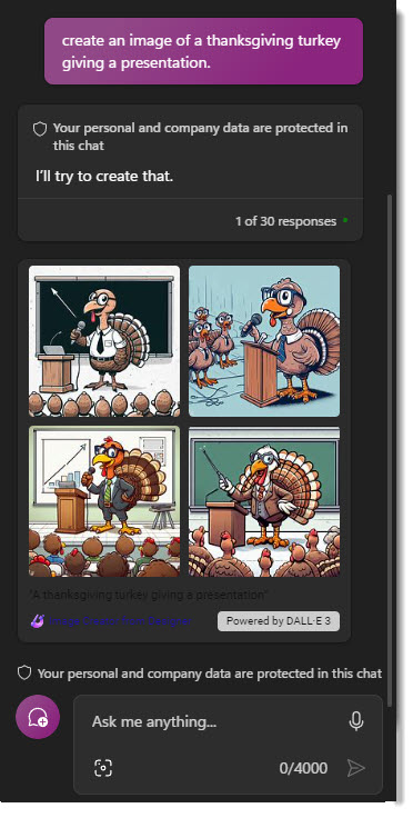
Happy Thanksgiving!
Happy Thanksgiving for those of us in the U.S.!
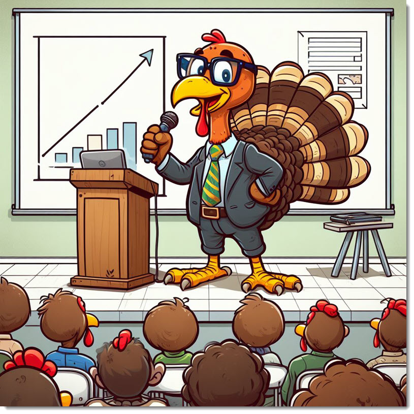
The fun and timely note about this post, and image, is I leveraged Microsoft’s newly released Windows OS Co-Pilot. I entered the prompt “Create an image of a Thanksgiving turkey giving a presentation.” 4 image options offered, all created by Dall-E-3, and the above is a royalty-free, good resolution (original image was 1024x1024px), creative and something no else has.
Troy @ TLC
Troy & Lori on The Presentation Podcast!
Listen to The Presentation Podcast for episode 186 with Troy and Lori of TLC Creative Services talking about their concept of “PowerPoint Concierge Level Formatting”.
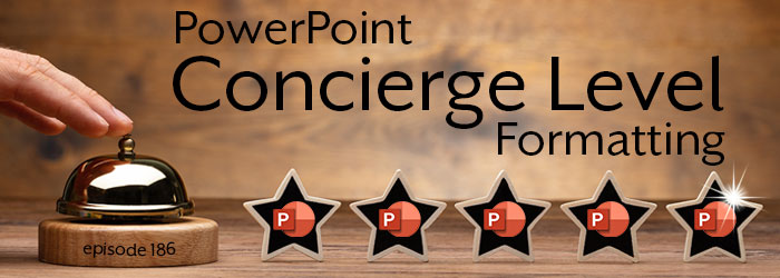
Curious? Listen here!
Hotel Room Art Out of Balance with the Room…
Have you ever looked at a slide that’s clearly been repurposed and feels unbalanced? Modifying existing slides for new content is a great shortcut and time saver, but step back and look at the slide. Is the layout balanced? Are elements aligned to each other? Does the slide look “correct”?
I had the immediate feeling of looking at a repurposed slide when I stepped into my hotel room (this is really a hotel room I recently stayed in – but no brands or cities named). Instead of noticing all the nice things this hotel is offering, my mind was distracted (like an audience member being distracted by a poorly designed slide):
- Why is the art not centered on the wall?
- Did the room originally have just one bedside table on the right so the bed would be centered under the art when the furniture was centered on the wall?
- Was this just a bad art installation, or was the art here first and a new bed installed later?
- If the art was here first, what was the furniture like before that would make an off-center art piece look good?
- Wait…is there a problem with the wall that it cannot support the art if mounted in the center? Am I safe sleeping under this unstable art!!?
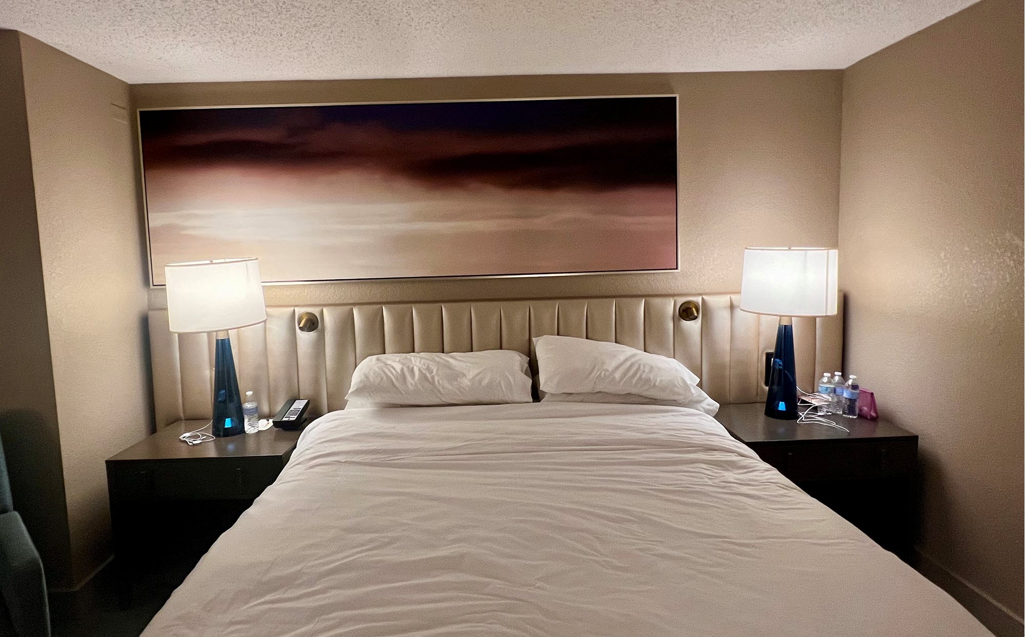
Moral – don’t create slides that let your audience get distracted with formatting questions. And don’t question the hotel room furniture and art choices, you are there for a short stay and will soon forget it (unless you use a photo of it for a blog post and then can be reminded of how odd it was for years-and-years!).
Troy @ TLC