Showsite “Office”
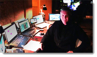
Backstage in Palos Verdes, CA (the Terranea Resort is a great property). Note the small 7″ USB monitor in the center of my show computers (not the 14″ version in the previous post).
– Troy @ TLC
Showsite/Travel Monitor
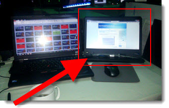
I work in a lot of locations that are not my office – where I have dual 23″ monitors, my favorite keyboard, mouse, track pad and really great speakers. What do I miss the most when I setup a temporary work station at a show? The extra monitor.
On the second monitor, for PPT, I run the slide show and edit the slides on primary monitor or if editing a highly animated section, I have a very large animation pane on it. I also use it for email, Windows Explorer windows and Lync.
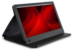
For a few years, I have traveled with a small 7″ USB monitor, which was nice, but not really fully functional. Enter my newest “toy” – the Toshiba PA3923U-2LC3, a 14″ USB monitor that is automatically recognized by Windows 7 and Mac OS Lion. And it’s more portable than the smaller monitor by folding into a thin portfolio case.
Here is my production computer at my temporary, backstage “office” on showsite this week in Puerto Rico.
– Troy @ TLC
Quotes Should Not Be Bullets (A Before-and-After Example)
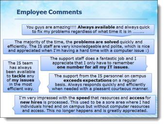
The supplied slide had plenty of great callouts end users, but in a bullet list it looks just like any other (boring) slide.
Taking a cue from IM (Instant Messaging) applications, each quote was put into a speech bubbles for a lively and visual slide layout. The key messaging of each is also bolded text to direct the audience.
– Troy @ TLC
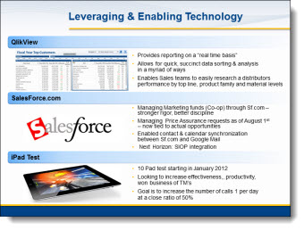
Technology That is Not Clear (A Before-and-After Example)
This a slide from a presentation makeover project. The original slide was typical in that had some photos, screen captures and bulleted list text. The overall design was clean and (overly) compartmentalized the content.
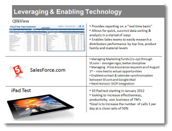
The makeover used the same images, bullet list text and focused on grouping content. In the final slide layout, it is much easier to quickly identify the 3 topics and the bullet lists are easier to read with improved line spacing and alignment.
– Troy @ TLC
The Timeline Road (A Before and After Slide)
As part of the presentation makeover, I wanted to take this process, that was central to an entire section of the presentation, and create a layout that visually supported the presenter’s talk and was more engaging to the audience.
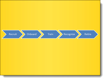
The core message was the process of engaging with a brand over many stages. The visual layout creates a road with the stages along it. Each stage is highlighted with supporting graphics.

– Troy @ TLC
Presenting the New “TLC Creative Services, Inc.” Logo
As part of the new design offices and needing new business cards, signage and everything else, Lori took on the task of updating our company logo – which was last revised in 2006.
All the same information, just some updated styling on the “TLC ” spheres (now vector art) and a more streamlined and modern linear feel to the text.
Look for it on the blog, website and where ever else the TLC logo appears.
– Troy @ TLC
PPT 2010 – PPT Web App – and SkyDrive = Perfect Partners for Interactive Online Tutorials
Fellow PPT MVPs Glenna Shaw and Luc Sanders have an online tutorial posted on the Microsoft MVP Blog that has great information. See it here.
While the PPT Web App is still limited compared to the full application, it is the best online option available at this point from any of the offerings (and it keeps your PPT file as a PPT file). If you have not tried the PPT Web App, this tutorial walks through the process of setting up the (free) account needed and offers tips on using it.
– Troy @ TLC