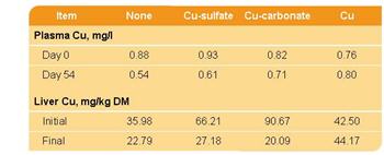
Tables contain lots of data – but often they do not blend with a presentations overall color scheme or design cues. Here is one example from a recent project that incorporated both the color scheme and design elements.
Color Scheme:
I filled the header bar with same color used for the bullets, bold text, and slide title area. The body of the table is filled with the presentation secondary color that was used throughout on several elements.
Design Cues:
The upper-left and lower-right feature rounded corners. Circles and rounded corners where a major design element throughout the presentation.
Up Next: How the rounded corners where created.
– Troy @ TLC