Tutorial

Overlapping PowerPoint Text

Typography: The art and technique of arranging type to make written language legible, readable, and appealing when displayed.

PowerPoint is a flexible design app. Sometimes it is not easy to accomplish design ideas as in other apps. As example, text kerning. PowerPoint does not use the design industry term “kerning” and the feature is not easily accessed.

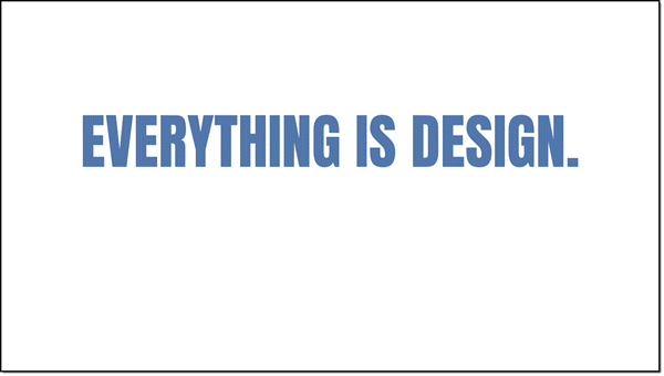
For example, here is some simple, all caps, text on a slide.

To add some visual design, letter colors are updated to the TLC color scheme (RGB).

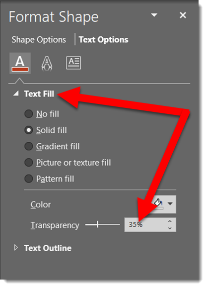
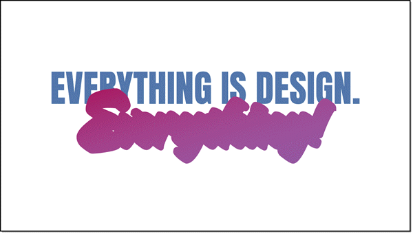
In preparation for the next effect, the opacity is lowered to

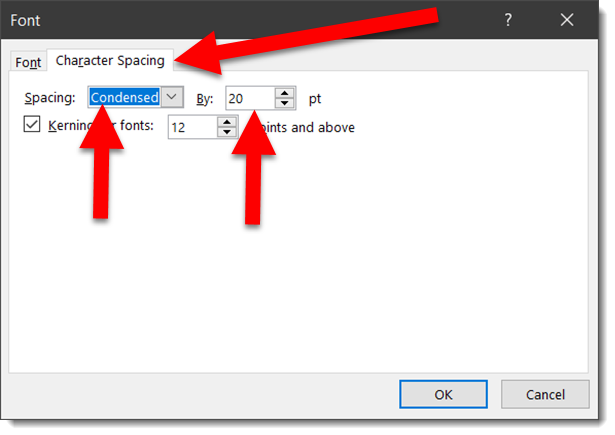
Now the actual kerning, what PowerPoint labels CHARACTER SPACING. Select the text, open the FONT dialog, view the CHARACTER SPACING tab. Change the spacing option to CONDENSED, which essentially is negative spacing (so the 20 pt used is really -20 pt).

The result is the text slightly overlaps and the transparency overlap creates a dynamic visual.

Done. Custom typography styling created all within PowerPoint and remains editable text.

Download the editable slide HERE.


– Troy @ TLC

By |2020-02-07T07:55:00-07:00February 12th, 2020|Portfolio, Tutorial|

Stacked and Mixed Text

Typography: The art and technique of arranging type to make written language legible, readable, and appealing when displayed.

PowerPoint is flexible. Like many design applications, text can be more than bullet lists of black text on a white background. One aspect of graphic design is creating visually engaging layouts with just text. As example, here is a slide one of the TLC Creative design team created – all in PowerPoint.

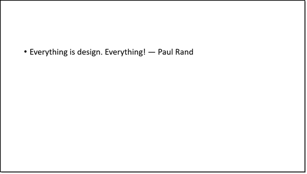
  1. Add text to a slide. Boring start, but now we know what we are working with.

2. To start the layout, the first section of the quote was set with a new font, ALL CAPS, and new color

3. The final word of the quote has some more extension PowerPoint styling. Starting with using a custom font and applying a text gradient fill.


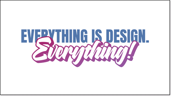
4. The custom font was a purposeful selection because the font family includes an outline version. The “everything” text box was duplicated, changed to the outline version of the font, set to a purple outline and white fill. Stacked, the two text boxes look great!

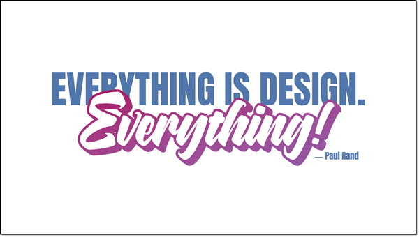
5. Last is adding the name as simple, small text in same blue as the top line.

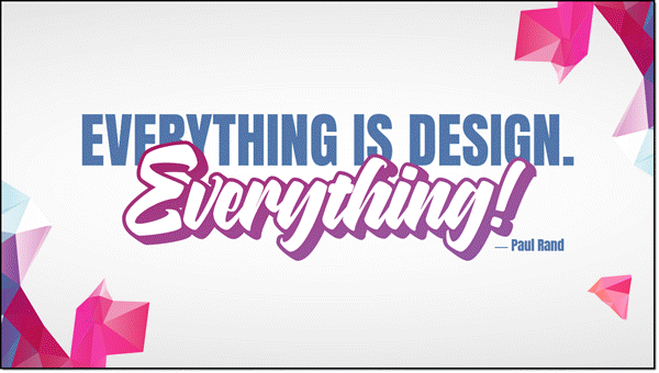
6. As a final design flare, a background image was added and sent to back.

Done. A complete graphic design text layout, completed in PowerPoint.

– Troy @ TLC


By |2021-06-18T08:16:06-07:00February 10th, 2020|Portfolio, Tutorial|

Use PowerPoint Text as Part of Background Design

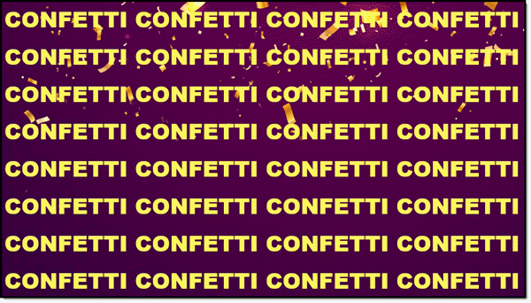
PowerPoint is flexible. This is both a design idea and PowerPoint how-to. The end goal is to add a light/ghosted pattern of text across the background of the template or set of slides.

This could be created in Photoshop, Illustrator, or PowerPoint!

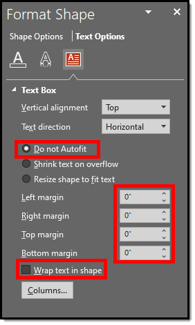
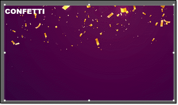
1. Start with creating the text to fit the slide. Insert a text box, add the word or phrase. Pick font and guess at best size. Set the text box settings to DO NOT AUTOFIT, zero margins, and check WRAP TEXT IN SHAPE.

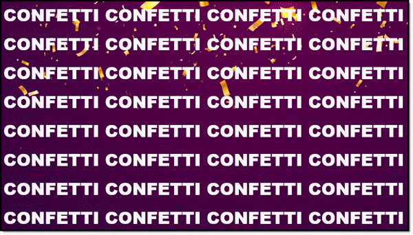
2. Copy the text and paste – paste – paste to fill the entire slide. Adjust font size and line breaks to have a slide full of the background message.


3. Add the background image – your choice of adding as inserted image and send to back or set as slide background.

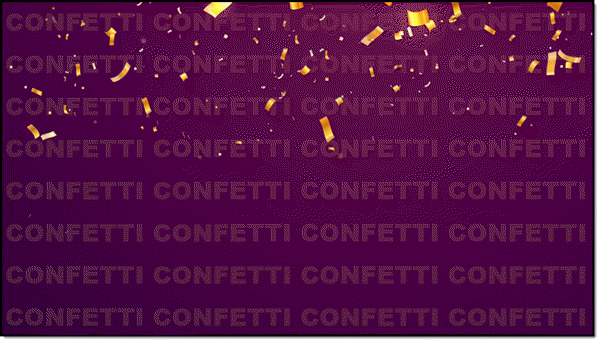
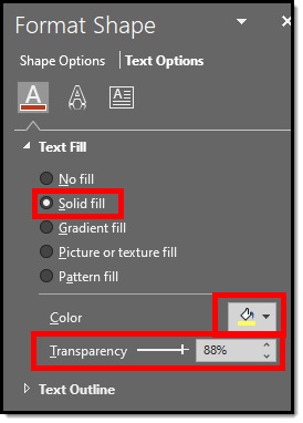
4. For the sample background in this demo, I want to coordinate with the gold confetti. Update text color to a gold.

5. Select the text box and adjust the text transparency to 88%.

6. Final result is a custom slide background design effect created in PowerPoint.

By |2020-02-07T07:09:42-07:00February 7th, 2020|PowerPoint, Tutorial|

Fire & Ice Text (Image Fill)

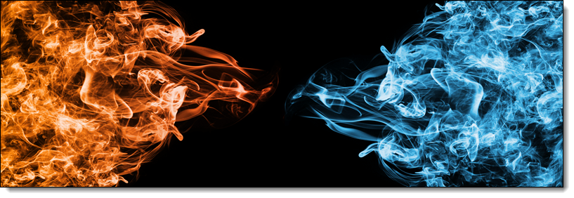
Finalizing our text treatment series, another way to make text more visually interesting is to fill text with a picture. Here is the image used for the next styling effect. Note that the fire and ice are within the same image:

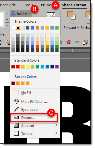
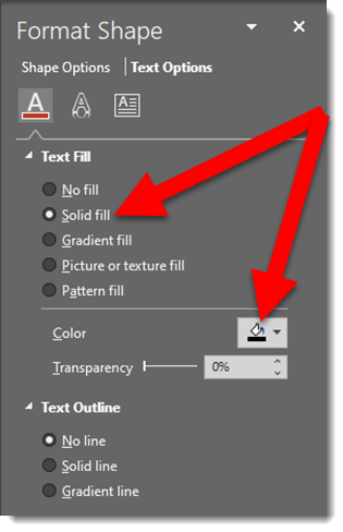
To fill the text with the image, on the ribbon go to SHAPE FORMAT (A), click TEXT FILL (B), select PICTURE (C)

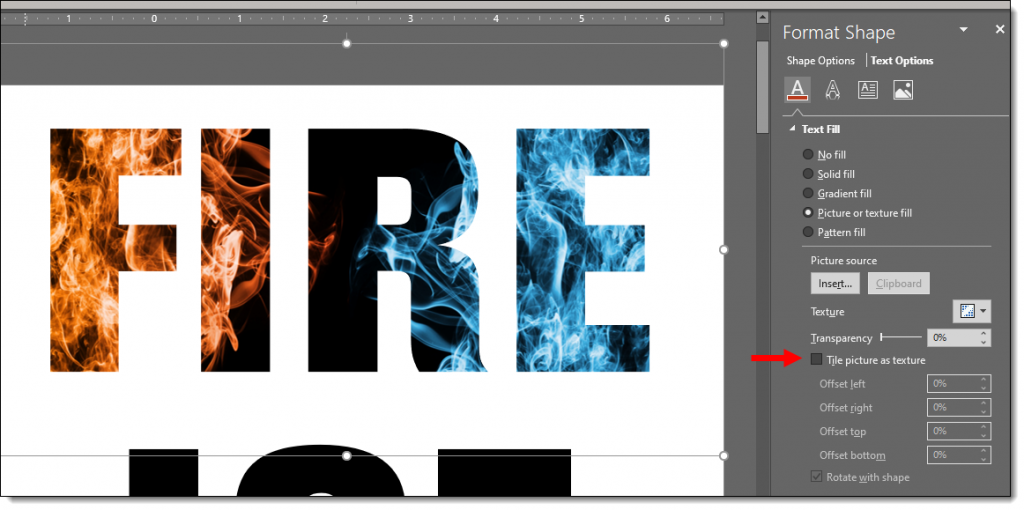
PowerPoints default is to make the image fill the selected text. In this case the image is “squished” to fit. But we want to show only the fire portion of the image on the FIRE text. To adjust the image, work from the FORMAT SHAPE and TEXT OPTIONS pane. Note: We cannot use crop tool to adjust fill image size/position, we must use the legacy fill offset tools.

  • Go to the TEXT FILL tab
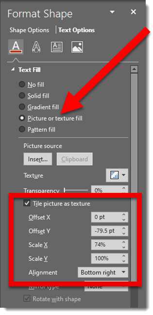
  • Select “Tile picture as texture”

Here is our image fill BEFORE checking “Tile picture as texture”

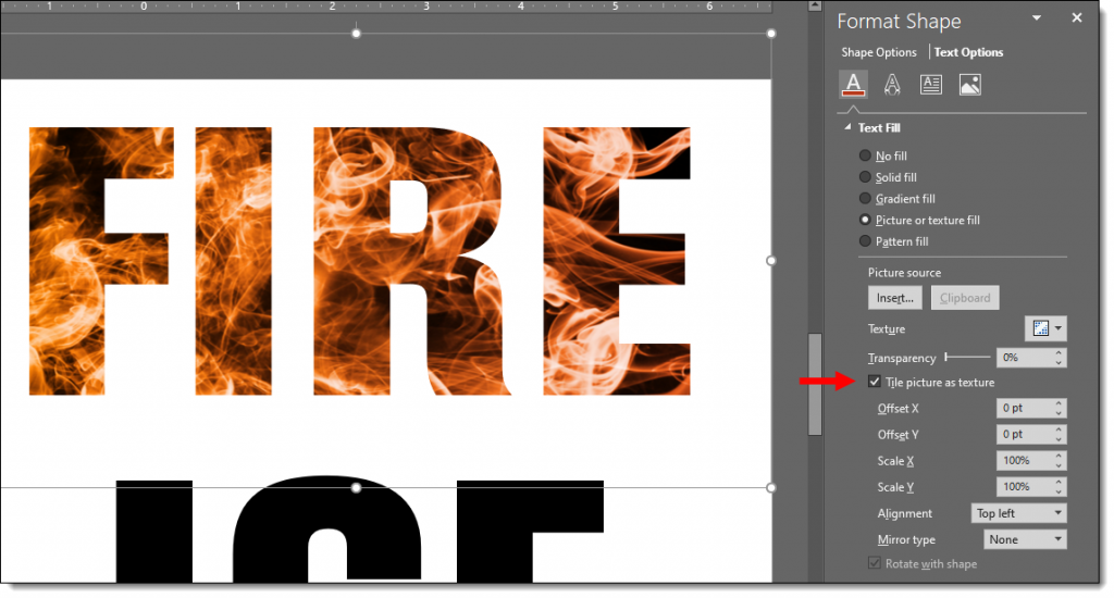
And here is our image AFTER checking “Tile picture as texture”

Now that the fire flames portion of the image is filling the entirety of the text, we have a few customizing refinements, but for the most part the default settings work:

  • Check TILE PICTURE AS TEXTURE
  • Set the Offset X & Y to 0 pt (default)
  • Set the X & Y SCALE to 100% (default)
  • Set the ALIGNMENT to TOP LEFT (default)

Similar adjustments for ICE:

  • Check TILE PICTURE AS TEXTURE
  • Set the Offset X & Y to 0 pt (default)
  • Adjust the X SCALE (width) to 62% which let’s us see some black area of the image for more visual interest
  • Set the Y SCALE (height) to 100% (default)
  • Set the ALIGNMENT to RIGHT

Text is still editable in PowerPoint. Styling options such as drop shadows and beveling can also be applied – be creative! Download the sample slide Here.

Troy @ TLC

By |2020-01-04T17:19:08-07:00January 10th, 2020|Tutorial|

Fire & Ice Text (Gradients + Styling)

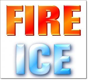
Continuing from the post with the Fire and Ice text using gradient fills, here styling effects applied for even more visually dynamic text.

This variation adds shadow and bevel effects to the text. The text remains editable, and the styling effects can be applied to any other text with the Format Painter tool! 

Here is the styling effects applied:

  • Select the text.
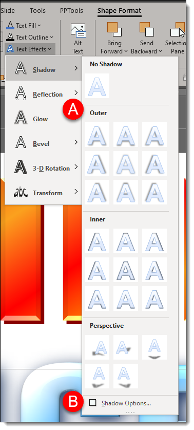
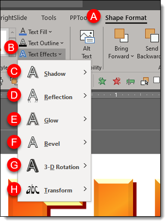
  • Go to SHAPE FORMAT (A) on the ribbon
  • Select TEXT EFFECTS (B)
  • The 6 customization options for text are: SHADOW (C), REFLECTION (D), GLOW (E), BEVEL (F), 3-D ROTATION (G), TRANSFORM (H)

  • For all effects, PowerPoint has preset styling options (A) to quickly enhance your text.
  • Each effect also has an OPTIONS (B) button to bring up the FORMAT SHAPE panel to the right of the artboard so you can customize the styling effects.

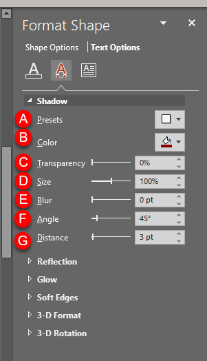
The FIRE text custom shadow settings:

  • In the FORMA SHAPE pane, go to TEXT OPTIONS.
  • Expand SHADOW
  • (A) is the PRESETS (same options available direct from the ribbon)
  • (B) COLOR. For the Fire text I used a hard edge dark orange and for the ICE text a super soft (fuzzy) dark blue.
  • (C) TRANSPARENCY (not used on this text)
  • (D) SIZE. 100% for FIRE and 101% for ICE.
  • (E) BLUR. 0 for FIRE and 14 for ICE.
  • (F) ANGLE. The default 45 degrees for FIRE and 55 degrees ICE.
  • (G) DISTANCE. The default 3 points for both FIRE and ICE.

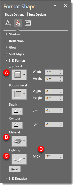
Next expand 3-D FORMAT

  • (A) TOP BEVEL: minimal for FIRE and large (softer) for ICE
  • (B) MATERIAL: FIRE = Dark Edge and ICE = Warm Matte
  • (C) LIGHTING: FIRE = Glow and ICE = the default 3 Point
  • (D) LIGHTING ANGLE: FIRE = 90° and ICE = 0°

Hopefully some text styling inspiration – all while keeping the text editable. Download the PowerPoint slide here.

Troy @ TLC

By |2020-01-04T17:18:40-07:00January 8th, 2020|Tutorial|

Fire & Ice Text (Gradient)

Text does not need to be a solid color and boring! As example, here are the two words Amber started with for this mini tutorial series.

Editable PowerPoint text does not need to be a solid color fill. Gradients take a bit of work, but can a great way to make text more visually interesting. And, this text is still editable! Because this text uses PowerPoint gradients, they can be applied to any other text with the Format Painter tool (to copy the style from one text box to another).
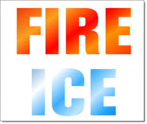
Each word is a separate text box and each has its own gradient fill styling. Here’s how the gradient was created:
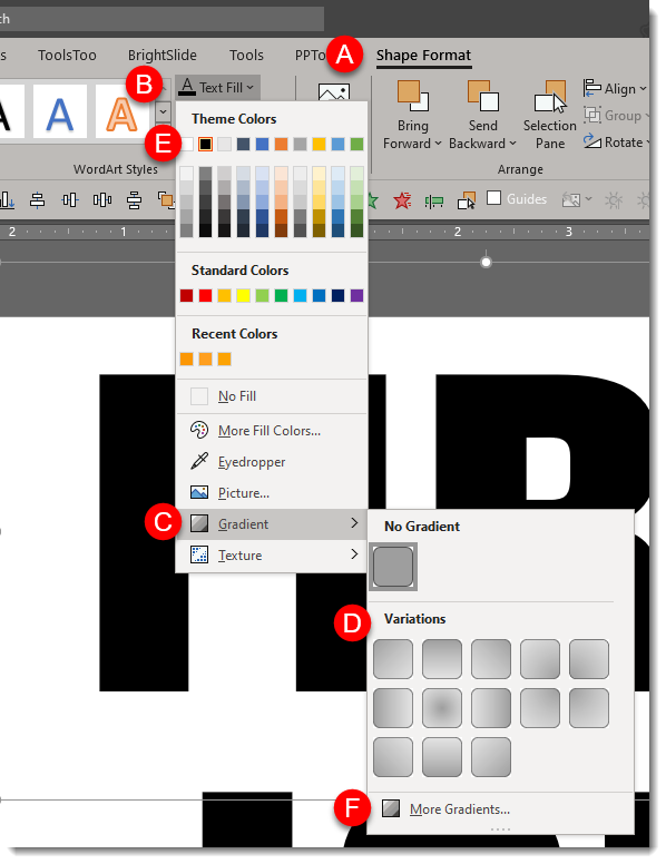
  • Select the text
  • Under SHAPE FORMAT (A) on the ribbon, click the down carrot under TEXT FILL (B).
  • Mouse over GRADIENT (C) to show the gradient fly out menu and select the gradient you want (D).
  • These first options are created using the text fill the text is set to, this example being black (E). To see more PowerPoint created variations, click the MORE GRADIENTS (F) at the bottom of the fly out menu.


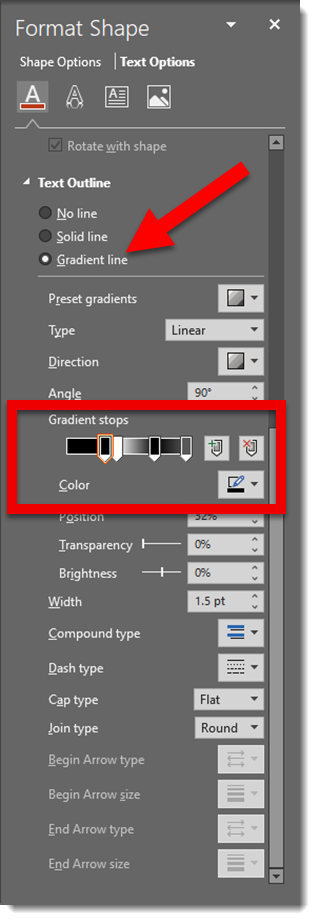
Click MORE GRADIENTS to see the FORMAT SHAPE pane. This is where we really have control to create custom gradients. The FIRE gradient is 5 gradient stops (eg. colors) set at an angle:
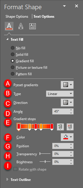
(A) PRESET GRADIENTS: These are gradients created using the 6 theme colors set in your file.

(B) TYPE: Change the type of gradient:
1. LINEAR: horizontal, vertical, diagonal
2. RADIAL: circular gradient starting from the center or from any of the 4 corners
3. RECTANGULAR: rectangular gradient starting from the center or any of the 4 corners
4. PATH: creates gradient in the shape of the object its filling

C. DIRECTION: Change the direction of LINEAR or RADIAL gradients

D. ANGLE: Change the angle of the direction of the gradient

E. GRADIENT STOPS: set the color points of the gradient. You can ADD (click anywhere on the gradient) or SUBTRACT (click and drag the gradient stop off) points and set the color of each.

F. COLOR: select the color for a gradient stop.

G. POSITION: you can fine tune the position of a gradient stop.

H. TRANSPARENCY: set transparency of a gradient stop.

I. BRIGHTNESS: set brightness of a gradient stop.


Download the FIRE & ICE gradient fill sample slide Here.

Troy @ TLC 

By |2020-01-04T17:18:10-07:00January 6th, 2020|Tutorial|

2019 to 2020 Stylized Text

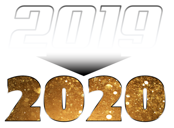
A popular visual for lots of presentations this time of the year is a visual that sets up a conversation about goals and expectations for the year ahead. Using just PowerPoint text and styling effects, here is a quick dynamic slide (editable slide download link at the end).

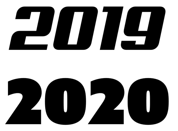
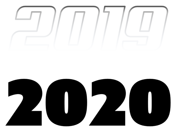
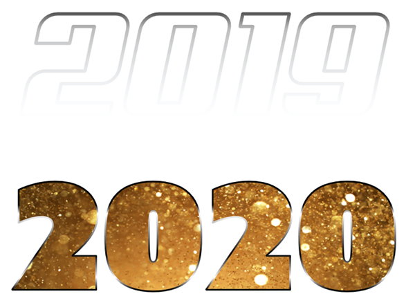
The goal of the slide is to show 2019 moving into 2020. The start of the slide is adding two text boxes:

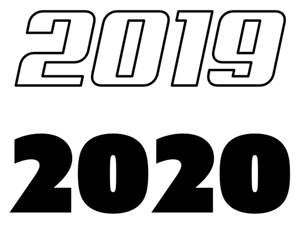
Using just the outline of text is a way to create text that feels “designed”. For this slide I am using a bold outline for the 2019:

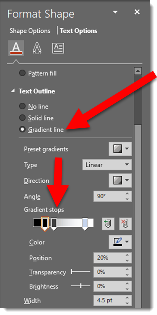
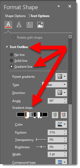
To create a visual of 2019 fading into 2020 the text has a custom gradient outline:

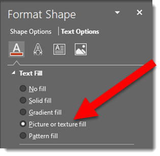
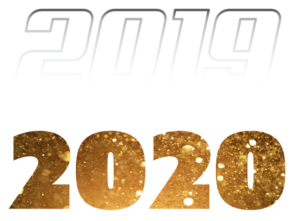
To make the 2020 literally dazzle and sparkle, I am using the same styling effect as the previous post – picture fill. Here is the image used and effects:

To enhance the 2020 text is further, a custom bold outline is applied:

And as a final touch, a graphic element is added to show the motion of 2019-to-2020. A PowerPoint arrow, sized wide and short with a gradient fill:

Download the PowerPoint slide HERE

Note: custom font used will default to available font when opened, but all effects remain intact.


Troy @ TLC

By |2020-01-04T09:29:55-07:00January 3rd, 2020|PowerPoint, Tutorial|

Happy New Year!! Let’s Talk About Stylizing Text in PowerPoint

Today is the first day of the new year, new decade, and new presentations! This month I am focusing on a dozen posts that have stylized text – all with native PowerPoint effects. For day 1 of 2020, I am turning a plain 2020 text into a stylized layout that visually shows the bright future ahead of us this year – and keeps the text editable!

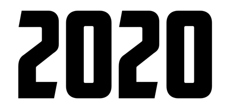
Here is the base text; black text on a white background, but a fun font “American Capitan”.

This is the text fill default; solid fill and black (or whatever the template has as the Dark 1 color)

Any photo can be used to fill the text. I have this inspirational photo of a sunrise to use

Select the text box, go to FORMAT SHAPE > TEXT OPTIONS > select PICTURE OR TEXTURE FILL > navigate to the sunrise photo and select it

The photo is not displaying the image as I want. The OFFSET and SCALE options move and size the image within the text

Now the “2020” image fill shows the bottom portion of the image and the sun itself positioned at the tip of the number 2 

Next is a stylized gradient outline

The final formatting is adding another image as the slide background and positioning the editable “2020” and applying a drop shadow

Troy @ TLC

By |2019-12-30T10:57:36-07:00January 1st, 2020|PowerPoint, Tutorial|

PowerPoint’s Arrange All

PowerPoint has an almost hidden feature, that has been there for quite awhile, and can be very useful when there are several presentations open – Arrange All.

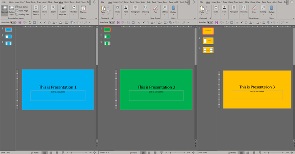
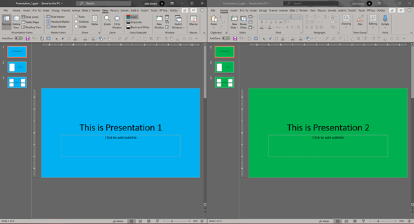
When working with multiple presentations in PowerPoint, there are times where you will have to switch back in forth between them. PowerPoint can make this easier and instantly layout all the presentations across the monitors like this:

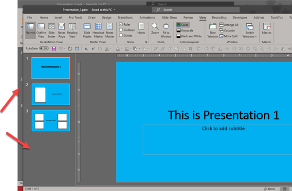
Go to the VIEW tab and the WINDOW section. There are a few options:

  • Arrange All
  • Cascade,
  • Move Split
  • Switch Windows

First, we will take a look at Switch Windows.

The SWITCH WINDOWS drop down menu shows a list of all currently open presentations. Select a presentation file name to bring that one to front.


CASCADE resizes and repositions all currently open presentations onto a single montior, slightly offset so you can see their separate windows.

ARRANGE ALL is one of our favorite features. This will evening divide all currently open presentations across the screen. This is particularly helpful when working on one presentation while referencing the other(s).

Here are 3 presentations instantly positioned on 1 screen. 

When working on multiple presentations simultaneously, things can get a bit hectic. This particular feature in PowerPoint makes life a little easier by making it simple to cycle to each presentation or by quickly displaying all presentations on screen.


Jake @ TLC

By |2019-10-06T10:41:07-07:00October 11th, 2019|Tutorial|

Sketched Outlines (Part 2)

I wanted to create a Part 2 to the PowerPoint Sketched Outline tool and share a more advanced shape consideration with using the Sketched outline styling. In this case, what happens when you use the Merge Shapes tools to create a new shape – and those shapes already have the Sketched outline styling applied?


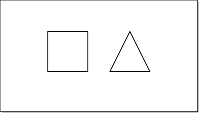
1. For this demo, I am inserting two 2 PowerPoint shapes

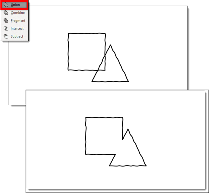
2. Apply a Sketch Styling to both shapes

3. Then combine them by using the PowerPoint MERGE SHAEPES “Union”

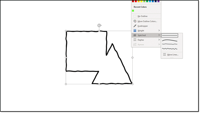
4. The new shape, which looks great, does have the Sketched outline permanently applied. Selecting the straight line optioncannot be selected to revert it back to smooth/straight lines.

5. The way to avoid this permanent styling is to pre-plan. Before merging the two shapes together change the outline to the smooth/straight outline.  Then re-apply the sketched outline styling to the new (merged) shape.

Troy @ TLC
By |2019-09-27T22:00:20-07:00October 7th, 2019|PowerPoint, Tutorial|
Go to Top