PowerPoint

Metallic Gradients

Metallic surfaces are created with gradients. Here are gold-silver-bronze-copper metallic gradients, all created within PowerPoint.

As example, the gold gradient is 6 color stops with asymmetrical spacing.

Download all 4 metallic gradients here.

Troy @ TLC

By |2022-03-07T11:08:51-07:00March 24th, 2022|PowerPoint|

Stylized Bevel Text Bar

Combining long gradients and hard transition gradients within a single shape was used in creating this beveled bar. In addition, because this is a PowerPoint shape, it can become a combination graphic element, and text box.

The bevel effect is created with a set of tight/hard stops on the far left and right. The bevel bar is created with 8 color stops.

Download a slide with the Beveled Callout Bar here.

Troy @ TLC

By |2022-03-07T11:36:55-07:00March 22nd, 2022|PowerPoint|

Create “Hard Transition” Gradients

By using the color stop positions gradients can be designed to be very short transitions, or “hard transitions”, to create new styling options.

As example, this full slide PowerPoint rectangle is created with 10 color stops* going from very dark blue to blue with long/smooth transition and a white hotspot (vertical line) created by positioning the color stops very close to the white creating “hard transitions.”

* TIP: the maximum number of color stops PowerPoint supports is 10.

Download a slide with this gradient fill shape, here.

Troy @ TLC

By |2022-03-07T10:53:09-07:00March 18th, 2022|PowerPoint|

PowerPoint Rainbow Gradient

Gradients from one color to another have nice smooth transitions. As example this 6 color rainbow:

On the design, the gradient fill is composed of 6 equally spaced color stops using the rainbow color spectrum.

Download the Linear Gradient Rainbow PowerPoint shape here.

Troy @ TLC

By |2022-03-07T10:46:27-07:00March 16th, 2022|PowerPoint|

Color and Transparency – This is the Secret to Many Gradients

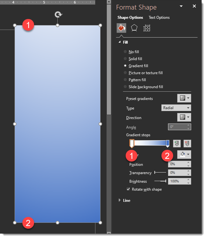
These 3 gradients are the same PowerPoint rectangle set as a 2 stop gradient. The goal is a smooth gradient from the solid color on the left to a nice transparency on the right. The visual appearance is a “1 stop gradient; color to nothing”.

#1 is solid colors, blue to white.

#2 is the solid blue to the white set to 100% transparency (ie. not visible)

#3 is the solid blue to a 100% transparency blue (this is the secret!)

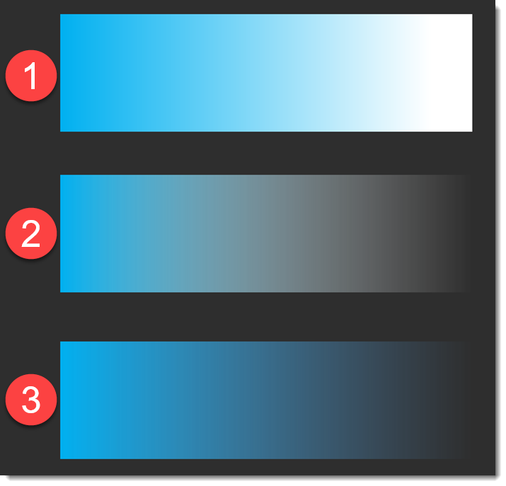
Looking at the details for the three gradients.

#1 displays exactly as expected; solid blue to solid white with a smooth gradient from left to right.

#2 is not what is expected; solid blue to a muddy grey. Note, stop #2 is white, which does not match the step #1 color and PowerPoint is showing the color blend from blue to white in the visible gradient (ick!).

#3 is the exact same transparency settings, but color stop #2 has been updated to be the same blue as stop #1. The result is a wonderful, smooth gradient of the left blue fading to nothing. The reason is that the color blend from blue-to-the-same-blue does not create any tertiary colors in the blend.

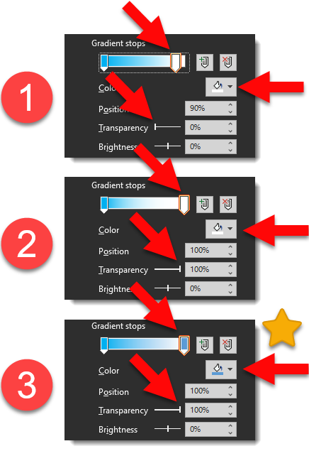
* * #3 is the secret to creating smooth fades to nothing in PowerPoint!

Troy @ TLC


By |2022-03-06T14:41:06-07:00March 11th, 2022|PowerPoint|

Stop! Gradients are composed of “Gradient Stops”

Gradients are created in the Shape Format dialog and adding additional color stops to a shape. These are all PowerPoint rectangles with 2-4 color stops added to the shape (with different colors, positions, angles, transparency and types).

The simple gradient is 2 stops where one side of the PowerPoint shape gets its color from one of the color stops and the other side of the PowerPoint shape gets its color from the second stop.

TIP: PowerPoint can have a maximum of 10 color stops.

Troy @ TLC

By |2022-03-06T14:25:44-07:00March 9th, 2022|PowerPoint|

Pantone Color of the Year Inspired PowerPoint Duotone Photo Effect

Duotone is the process of converting an image to two colors. Like a greyscale photo, which is two colors, black and white, but with colors. For this example, I unintentionally cheated by starting with a greyscale image vs a full color image. Working with a real PowerPoint template, such as the Very Peri Wellspring template we released earlier this month, creating duotone images is amazingly easy in PowerPoint – and can be a great styling option.

The Wellspring template was based on the Pantone Very Peri inspired color scheme, that Pantone named “Wellspring”. The TLC Creative design team developed a template that highlighted the Pantone color scheme – and preset the PowerPoint colors to use the Pantone color scheme colors.

Any image in the deck can be selected. Go to PICTURE FORMAT > ADJUST tab > COLOR drop down > RECOLOR. The template theme colors are available in the preset options. Any color can be assigned to the Recolor (aka duotone) with the MORE VARIATIONS option.

For this example, I opened the Very Peri Wellspring template TLC Creative developed. Searched the Microsoft image library and selected the stopwatch image. (1) The image was sized and cropped to fit the template Full Frame layout. (2) An inner shadow was applied to the image. (3) using the Recolor feature, I opted for the Very Peri purplish color. (4) Last was to find a “time” related quote and do some typesetting for the layout.

Download the slide set Here.

Troy @ TLC

By |2022-02-19T15:49:28-07:00February 28th, 2022|PowerPoint|
Go to Top