PowerPoint

Template Design – and New Microsoft Fonts

I am working a PowerPoint template project (yes, this is the real art, for a real template – and yes, I have removed logos and product indicators – and yes, PowerPoint design can be fun!).

What I want to highlight in this post is this awesome new Microsoft hand drawn style font, Dreaming Outloud Pro. I actually do not know when it was officially added, but one of our designers found it and added to the template concept and I love it!

Troy @ TLC


By |2023-10-09T14:54:35-07:00October 12th, 2023|PowerPoint, Resource/Misc|

New Episode at The Presentation Podcast!

The Presentation Guild represents us, the presentation industry representation. The Guild’s monthly email newsletter with its list of activities and opportunities for presentation designers inspired this episode. We are joined by 4 of the current Guild board members to talk about the Presentation Guild, its events, how they are announced, who can attend, what is planned, and more! Listen HERE.

Troy @ TLC

By |2023-10-02T11:55:07-07:00October 3rd, 2023|PowerPoint|

Remove Old Presentations from PowerPoint’s “Recent” List.

Have you ever gone to open a PowerPoint file, selected a presentation from the RECENT list, and got the “File-not-found” error message?

I have found that PowerPoint, and all Office Apps, are not really good at keeping track of files listed in the Recent list. Once a file is added to the Recent list, the listing stays there – even if the file is moved to a different location, renamed or deleted – for all time, and the original location and name are what’s referenced. Essentially, PowerPoint can take the file name, but it doesn’t guarantee it will be available when you click on it.

There is an option to manage what is displayed in the Recent menu, but it’s not easily discoverable. Right-click on the line with the file that should not be displayed in the Recent list. Then select REMOVE FROM LIST. The file is not being deleted. Only it being displayed on the Recent list will be removed.

Troy @ TLC

By |2023-09-08T11:23:51-07:00September 14th, 2023|PowerPoint, Resource/Misc|

Why Separate Text Boxes Over Shapes is BAD

Continuing on from the previous post, “Circles and Text (that does not fit)“, with some best practice reasons for NOT stacking a text box on top of a shape.

  • It is lazy formatting.
  • Often it is because knowing how to control PowerPoint’s text formatting within a shape are not features used (see the previous post on using shape internal margins as an example of formatting options that are not commonly used).
  • It makes future edits to the slide tedious. As an example, two elements, the shape and the text box, need to be moved together to stay aligned.
  • Text boxes stacked on top of a shape generally are not truly horizontally aligned to the shape. As example, a text box stacked on top of a shape with the text horizontally centered is most likely not actually centered, because the text box margins push the text off center – ugh!
  • Animation seems easier, but again, a shape and text within the shape can be set as independent elements on the animation timeline – overcoming almost every instance where the two separate elements have been stacked and animated separately.
  • The Office/PowerPoint accessibility tools do not work, because they have several limitations on identifying stacked elements. As example, white text on top of a light blue shape is (currently) not seen by the accessibility checker as a flagged low contrast item, because PowerPoint looks at a text box, what that text box shape fill color is, and then the slide background. It ignores layered elements.
  • It is easier to manage text line wraps if the text is within a shape vs. manually adjusting – and the line wrap needs are automatically updated when the shape, or the text size, is updated – if the text is part of the shape.

The important message is, creating PowerPoint slides is a balancing act of what is fast and looks okay vs. using best practices to create slides that are future-proofed for easy formatting and use.

Troy @ TLC

By |2023-08-31T16:21:06-07:00September 1st, 2023|Personal, PowerPoint|

Office has a New Default Color Scheme!

The last post highlighted the new default font, Aptos. There is also a new default color scheme!

The revision is subtle as you can see with the side-by-side comparison. The Standard Colors remain unchanged (unchanged since 1998 I believe!). I learned much of the color decisions the Microsoft team takes into consideration are for accessibility needs – and there is a lot of documentation and reason for each color selected. The formula for the color tints remains unchanged, and not accessible to users.

Here is a larger view of the color chips

In researching the previous color schemes for a comparison, I located color schemes for Office 2007-2010, then Office 2013-2022 and the new theme that is just labelled “Office Theme”. There is not a missing color scheme. The naming is based on the version number of PowerPoint, and we had no new version of PowerPoint between 2010 and 2013!

Troy @ TLC

By |2023-07-31T14:00:12-07:00August 10th, 2023|PowerPoint|

Office has a new default font – Aptos!

PowerPoint, Word, Excel and Outlook officially have a new default font.

Note: As of today I am not seeing the new font used when I open a blank presentation, on both desktop app and PowerPoint online, but it is coming! The Aptos font family is available in the font list, but not used as the default font when opening new, blank documents. Because the Aptos font has officially been announced and released, I think it will be rolled out to everyone within the next few weeks – assuming they are on a Microsoft 365 subscription.

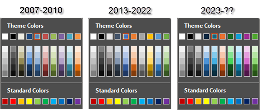
Quick history of the default font in Microsoft Office apps:

  • Times New Roman – default font until 2007
  • Calibri – 2007 to 2023
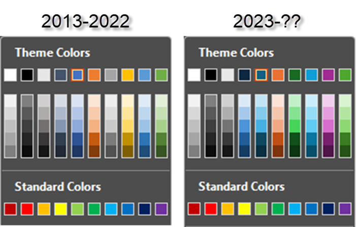
  • Aptos – 2023 to ??

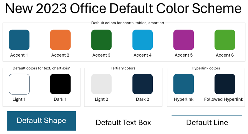
From Si Daniels, a principal program manager at Microsoft, “Aptos is a part of a broader wave of features coming to Microsoft 365. We’re pushing to make the software more expressive and inclusive,” explains Daniels. “There’s a newly designed font picker experience, along with new themes, colors, and backgrounds.” More on these over the next few posts!

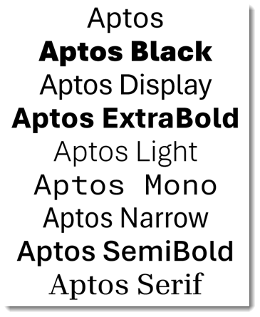
Other notable information about Aptos:

  • It has 24 font types
  • It is designed to work equally well for high-resolution display and print, from very small to very large
  • It is designed for global use, supporting all major languages
  • The process began several years ago when Microsoft started the replacement to Calibri by adding five new fonts in 2021; Tenorite, Bierstadt, Skeena, Seaford, and Grandview
  • Bierstadt and Aptos are the same font. In 2023 the Bierstadt font was renamed to Aptos, but the font in both names remains available

I am excited by this font. The variety of font weights and sizes means a single font can be used throughout a presentation or document and provide visual variety, hierarchy and creativity.

-Troy @ TLC


By |2023-08-01T10:28:23-07:00August 8th, 2023|PowerPoint|

5 PowerPoint Accessibility Checker Errors

This is fantastic information! Bookmark it, because at some point, we will all be asked to make a presentation that meets accessibility needs. Stephy put this great video on YouTube, and I am listing it here to let everyone know of it, and to keep it as a reference for our team to find it in the future!

Watch the video here: https://www.youtube.com/watch?v=p46jZ0q8blI

Troy @ TLC

By |2023-04-08T12:39:18-07:00April 6th, 2023|PowerPoint, Resource/Misc|
Go to Top