PowerPoint

PowerPoint for Print Poster Design

“PowerPoint Documents” is our internal term for using PowerPoint as the design tool for print/PDF documents. These do not use slide transitions, animations, or other “presentation” features. This example is a part of previous post project (sync’ing narration to animated slides), where in addition to the presentation design we developed a 24″x36″ poster that visually coordinated with the presentation design.

SofnetPosterImage_1 SofnetPosterImage_2

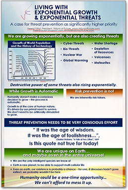
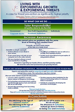
Note: Typically we would design this in Adobe InDesign for assure print quality, full bleed design, etc.

The request was to develop in a PowerPoint so edits could be completed by the client for each talk. We setup with a custom page size, optimized the graphics for the larger slide size, added the requested content. The end deliverable was the 2 posters, 2 slides in a PowerPoint document. The client was able to revise content, create PDFs to send out or print (and we included print quality specifications regarding PDF from PowerPoint resolution).

– Troy @ TLC


By |2016-08-10T09:05:34-07:00July 8th, 2015|Portfolio, PowerPoint|

Talk Narration in the Presentation

With audio being so easy to embed into PowerPoint, we are having many clients request we create a version of the presentation with their talk embedded into the slides.

PowerPoint does have audio recording features, but we opt for pre-recorded audio that is recorded distraction free of the slides, higher audio quality and we can edit in an audio editing program. We also develop 1 audio file per slide (if a client provides one audio file for the entire presentation we chop it into multiple files using Adobe Audition, or directly in PowerPoint by trimming the file to each slide needs).

Sofnet_1

For this specific project, we were provided individual audio clips for each slide. We sync’d the animations to the audio narration, which is a great end result, but a tedious process of listening and re-listening to the entire audio file while adjusting the animation timing to get everything perfect (an animation timeline feature I would really like to see the Microsoft PowerPoint team update!). Slide transitions and all animations were set to automatic.

Sofnet_2

We provided 3 deliverables for this project:

1. Editable PowerPoint, with on-click animation and transitions.

2. Editable PowerPoint presentation with audio narration embedded and animations & transitions set to auto.

3. A video version of the presentation (exported direct from PowerPoint).

– Troy @ TLC

By |2016-08-10T09:06:05-07:00July 6th, 2015|PowerPoint|

Design Idea – Group Text Into A Visual Layout

Slide design is usually thought of as making the content professional and visual – which it is. It is also about understanding the message and purpose of the presentation and each slide – something TLC Creative Services enjoys working with clients to uncover. For this slide from a recent project our design team developed a new layout that grouped the paragraphs of text into information chunks, and created a visual styling that coordinates with the clients overall visual branding.

Text-to-visual

This slide is a handout provided to everyone in the training, so large font size was not a primary need. The ability to identify sections of text within the 3 paragraphs was important for the group discussion. Working with the client we identified 5 topics and added subheads to each, then the full text from the provided paragraph. The end result is a slide that would not be ideal if just presented on a screen (too much small text), but a slide that works as a handout and aids the trainers group discussion.


– Troy @ TLC


By |2016-08-10T09:08:54-07:00February 23rd, 2015|Portfolio, PowerPoint|

Diabetes Before-and-After Slide

Continuing this month’s theme of Slide Design ideas, this is a before-and-after slide from a project we completed.

Diabetes-before-after

The before is a common slide: title and bullet list as provided by Microsoft’s default template. Our design team reviewed the presentation message and made the recommendation that this list be converted into a 3 column visual layout. The idea is to help the audience group the content to be able to quickly identify the message and focus on the presenter. Ideally, we would like to help the audience further by reducing the amount of text on slide, but for this one the request was to maintain the provided content. The end result, even with the same amount of content, is a much more lively slide designed for the audience.


– Troy @ TLC

By |2016-08-10T09:10:19-07:00February 11th, 2015|Portfolio, PowerPoint|

Olaf PowerPoint Slide

Special recognition to TLC designer Jennifer for this wonderful 3D illustration all developed in PowerPoint 2013!

Olaf-1

The video shows the development of Olaf in flip-book style animation. The first part of the video is a fast animation, followed by a slower version that shows each design step. Enjoy!

[KGVID]https://thepowerpointblog.com/wp-content/uploads/2014/12/unnamed-file.mp4[/KGVID]

In addition to the obvious PowerPoint 3D and shadow options, most of the development relied on PowerPoint’s Merge Shapes tools.

Olaf-4

– Troy @ TLC

By |2019-10-28T15:18:18-07:00December 15th, 2014|Portfolio, PowerPoint, Resource/Misc|

Fall Time Employee Recognition Slides

For a recent employee update presentation that TLC designed for one of our clients, we created a seasonal Fall Time themed set of slides for their employee recognition. Using PowerPoint 2013 and the ability to layer content on top of video, embed video, and custom motion path animations to develop these wonderful slides.

[KGVID]https://thepowerpointblog.com/wp-content/uploads/2014/11/unnamed-file.mp4[/KGVID]

– Troy @ TLC

By |2019-10-28T10:13:19-07:00November 21st, 2014|Portfolio, PowerPoint|

Providing More Than Just Slide Beautification

Here is a graphic supplied by the client for a recent presentation design project . Quick – what is wrong?

numbers-1


In developing ideas for a new way to show this information we noted the pie chart numbers add up to greater than 100% (108.4%). We let our client know of this and received a great soundbyte “Wow, you guys actually look at the content you are working with!”

Yes, TLC is very picky about the aesthetics (color scheme, alignment, consistency) AND the message.


– Troy @ TLC

By |2016-08-10T09:19:16-07:00November 10th, 2014|Portfolio, PowerPoint, Resource/Misc|
Go to Top