Portfolio

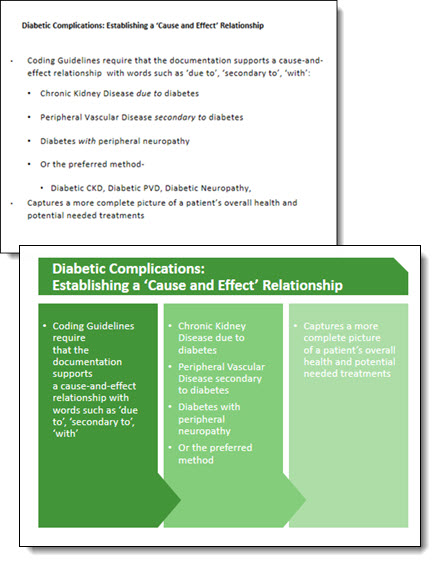
Design Idea – Group Text Into A Visual Layout

Slide design is usually thought of as making the content professional and visual – which it is. It is also about understanding the message and purpose of the presentation and each slide – something TLC Creative Services enjoys working with clients to uncover. For this slide from a recent project our design team developed a new layout that grouped the paragraphs of text into information chunks, and created a visual styling that coordinates with the clients overall visual branding.

Text-to-visual

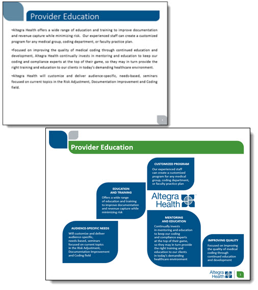
This slide is a handout provided to everyone in the training, so large font size was not a primary need. The ability to identify sections of text within the 3 paragraphs was important for the group discussion. Working with the client we identified 5 topics and added subheads to each, then the full text from the provided paragraph. The end result is a slide that would not be ideal if just presented on a screen (too much small text), but a slide that works as a handout and aids the trainers group discussion.


– Troy @ TLC


By |2016-08-10T09:08:54-07:00February 23rd, 2015|Portfolio, PowerPoint|

Diabetes Before-and-After Slide

Continuing this month’s theme of Slide Design ideas, this is a before-and-after slide from a project we completed.

Diabetes-before-after

The before is a common slide: title and bullet list as provided by Microsoft’s default template. Our design team reviewed the presentation message and made the recommendation that this list be converted into a 3 column visual layout. The idea is to help the audience group the content to be able to quickly identify the message and focus on the presenter. Ideally, we would like to help the audience further by reducing the amount of text on slide, but for this one the request was to maintain the provided content. The end result, even with the same amount of content, is a much more lively slide designed for the audience.


– Troy @ TLC

By |2016-08-10T09:10:19-07:00February 11th, 2015|Portfolio, PowerPoint|

Olaf PowerPoint Slide

Special recognition to TLC designer Jennifer for this wonderful 3D illustration all developed in PowerPoint 2013!

Olaf-1

The video shows the development of Olaf in flip-book style animation. The first part of the video is a fast animation, followed by a slower version that shows each design step. Enjoy!

[KGVID]https://thepowerpointblog.com/wp-content/uploads/2014/12/unnamed-file.mp4[/KGVID]

In addition to the obvious PowerPoint 3D and shadow options, most of the development relied on PowerPoint’s Merge Shapes tools.

Olaf-4

– Troy @ TLC

By |2019-10-28T15:18:18-07:00December 15th, 2014|Portfolio, PowerPoint, Resource/Misc|

Pixar Cars Template

Pixar properties are fun projects! For this new marketing template for the Cars franchise, we were asked to develop a PowerPoint template that made use of a Chrome chevron/triangle, lots of McQueen’s metallic red paint, a McQueen character and the Disney Pixar Cars logo. Along with custom bullets (in the shape of bolts and rivets), this is the final template styling.

Pixar-Cars_template

Note: This post is only to highlight the design work of TLC, we cannot provide this template to anyone (sorry).


– Troy  @ TLC

By |2016-08-10T09:16:56-07:00December 3rd, 2014|Portfolio, Templates/Assets|

Fall Time Employee Recognition Slides

For a recent employee update presentation that TLC designed for one of our clients, we created a seasonal Fall Time themed set of slides for their employee recognition. Using PowerPoint 2013 and the ability to layer content on top of video, embed video, and custom motion path animations to develop these wonderful slides.

[KGVID]https://thepowerpointblog.com/wp-content/uploads/2014/11/unnamed-file.mp4[/KGVID]

– Troy @ TLC

By |2019-10-28T10:13:19-07:00November 21st, 2014|Portfolio, PowerPoint|

Providing More Than Just Slide Beautification

Here is a graphic supplied by the client for a recent presentation design project . Quick – what is wrong?

numbers-1


In developing ideas for a new way to show this information we noted the pie chart numbers add up to greater than 100% (108.4%). We let our client know of this and received a great soundbyte “Wow, you guys actually look at the content you are working with!”

Yes, TLC is very picky about the aesthetics (color scheme, alignment, consistency) AND the message.


– Troy @ TLC

By |2016-08-10T09:19:16-07:00November 10th, 2014|Portfolio, PowerPoint, Resource/Misc|

(Try 2) Animation Sample – It’s a Small World

This is the 2nd posting of this sample as the post last week did not include the video of the PowerPoint slides… oops.

These are slides from a recent presentation and the video below is the animated version of the 4 slides:

SmallWorld-1

With some creative layout and PowerPoint animation, the presenter used this animated sequence to convey the message of their expanded Social Media presence and how it has a global reach (all animated on clicks):

[KGVID]https://thepowerpointblog.com/wp-content/uploads/2014/10/unnamed-file-2.mp4[/KGVID]

– Troy @ TLC

By |2019-10-28T15:22:00-07:00November 3rd, 2014|Portfolio, PowerPoint|

Halloween Animation

This is a great animation from a Halloween themed template TLC designer, Jennifer, developed.

[KGVID]https://thepowerpointblog.com/wp-content/uploads/2014/10/unnamed-file.mp4[/KGVID]

The slide was developed with this nice background art setup on the master slide.

Halloween2014Animation-3

Then the Halloween art elements were added to the slide.

Halloween2014Animation-4 Halloween2014Animation-2

Here is the slide composed of the full moon background, all art elements and text boxes.

Halloween2014Animation-6

The animation pane shows lots is going on to create the motion on the slide (the addition of a real ‘loop animation section’ would make this type of slide much easier!).

Halloween2014Animation-1

– Troy @ TLC

By |2019-10-28T09:56:49-07:00October 27th, 2014|Portfolio, Templates/Assets|
Go to Top