Lori’s Card #1
Starting things off is Lori Chollar, CEO of TLC Creative Services, who drew card #1 – Basic Chunking (I am admittedly biased, but this is a great slide design, and why Lori is always in demand for presentation design!).
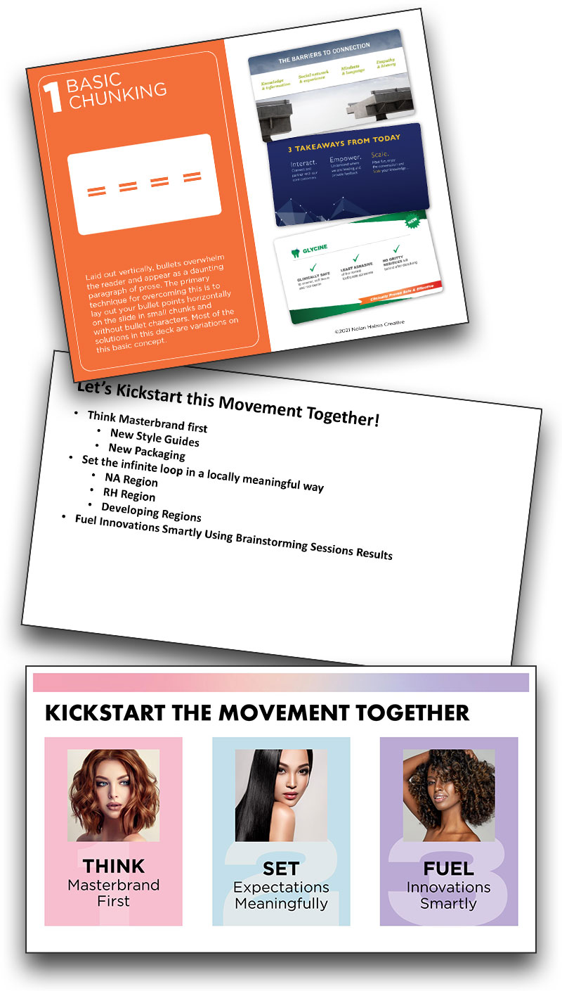
Starting things off is Lori Chollar, CEO of TLC Creative Services, who drew card #1 – Basic Chunking (I am admittedly biased, but this is a great slide design, and why Lori is always in demand for presentation design!).
For our Creative Challenge #5, the design team utilized Isometric Illustration for the collaborative bar chart. If you’re unfamiliar, isometric illustration is a type of 3D drawing perspective that is based on using 30-degree angles. By using the same scale for every axis, the image remains proportional and non-distorted. Isometric design also creates a uniform footprint for elements so they are interchangeable with other elements and provide a consistent layout perspective across elements, and slides. For this project, the isometric layout guaranteed that each designers art for their assigned country would appear consistent and uniform with all of the other elements. The bar chart bars also were based on the same isometric 30-degree angle perspective.
In the previous blog posts on our COVID Design Challenge #5, you saw that one of the main goals was to collaborate through Microsoft Teams. This included dividing up the bar chart by country: each designer was assigned one country to create isometric artwork for. Here is an example of design process of one building, and country “tile”. Kelli on our design team was assigned Iceland – pretty fun, until she realized there aren’t a lot of isometric designs out there for Icelandic landmarks! So, she made her own! Here is a walk through of her design process:
Kelli identified this building, the Hallgrímskirkja Church in Iceland, as a notable and recognizable landmark:
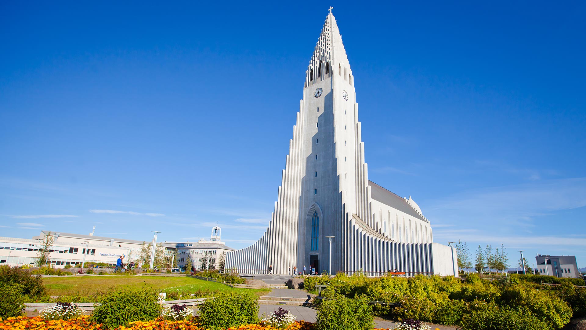
(Image courtesy of Nordic Visitor Iceland)
Beautiful – and very complex! Kelli broke down her design process for turning this Icelandic landmark into an Isometric illustration.
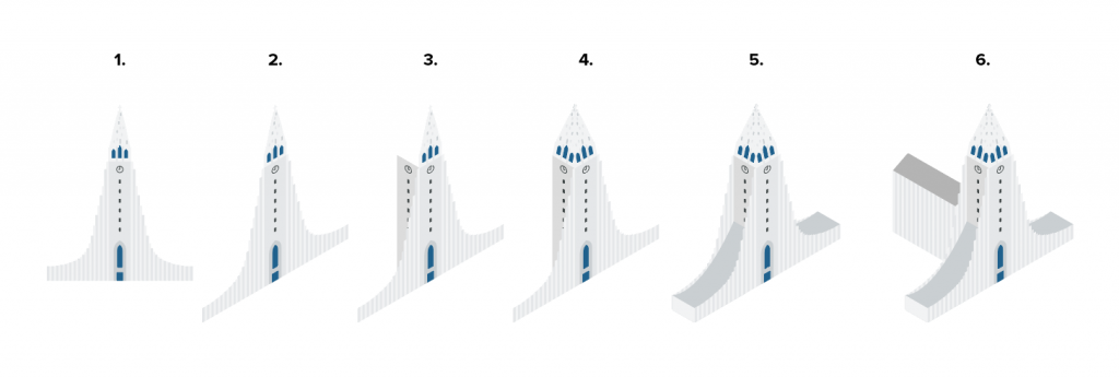
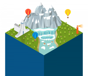
The Hallgrímskirkja Church was integrated into her version of the Iceland landscape and set atop one of the bars in the chart assigned to her.
Our very creative design team took this week’s highly collaborative challenge and turned it into something incredible! Not only did they communicate and collaborate efficiently and effectively, but they took the idea of a bar chart to a new dimension (or perspective)!
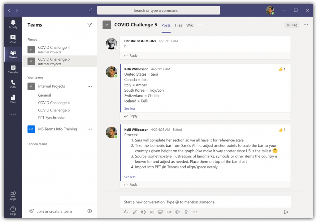
The TLC Creative design team kicked off the project with a group call using a Teams’ video meeting. The discussion was focused on ideas of what they wanted the result to visually be, how to divide the tasks, and assign roles and responsibilities. They used the Posts tab in the designated channel to post a recap of what was covered on the call for those that couldn’t make it:
The design team decided to maintain the bar chart concept, but with a more decorative and visual styling. Color scheme identified, perspective agreed upon, and graphic style to represent each country established. Each team member created their assigned country’s artwork and data viz graph. Each was merged into the core PowerPoint file hosted in the Microsoft Team.
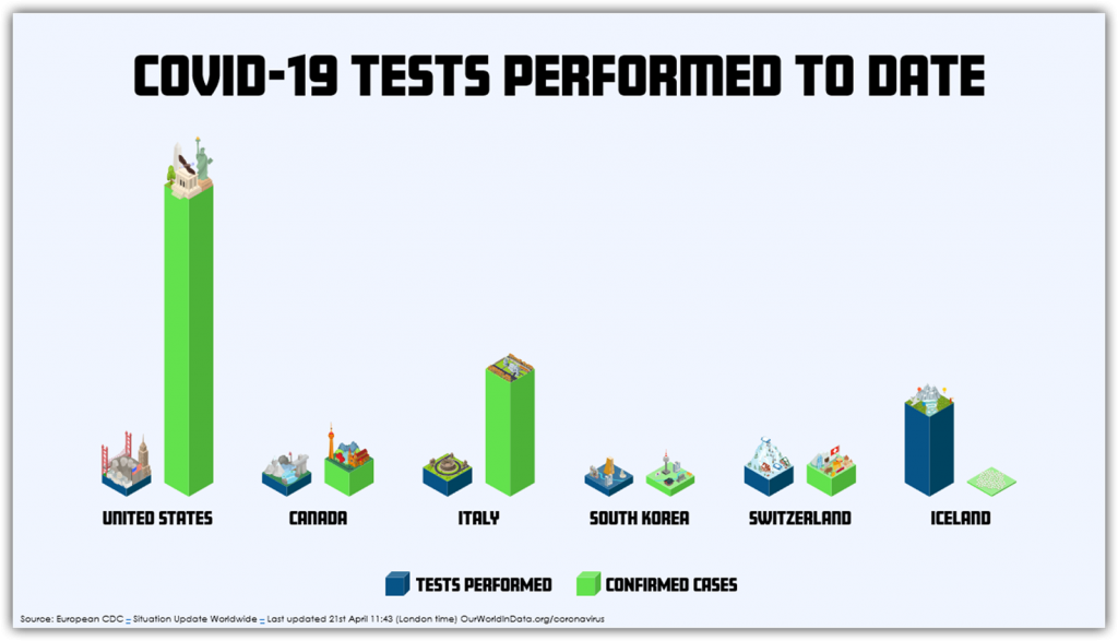
The next phase was another group collaboration meeting to discuss options for moving from good to a great visual. Here is the final team collaboration chart and slide layout:
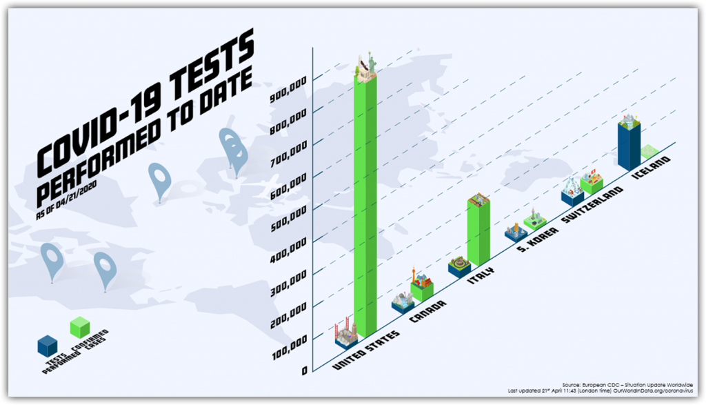
All text is editable in PowerPoint. All elements are imported .svg graphics that can be adjusted in PowerPoint. The entire process of working from a central Teams file with everyone’s edits automatically incorporated for the other designers to instantly see and work in tandem with each other was a success! Our design team did a great job on this challenge and, as a bonus, our design studio is using Microsoft Teams more than ever now for communication and collaboration!
Troy @ TLC
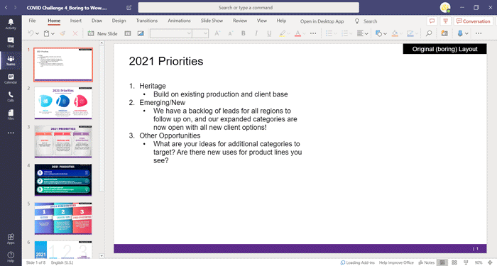
It has been a fun week designing a WOW slide – and working with a Microsoft Teams workflow! The TLC Creative design team’s entries for Challenge #4 are in and they all succeed in going from the boring bullet list to a spectacular WOW slide design.
As a reminder. the design team was tasked with not only a slide design, but to work from one shared presentation file hosted in a Microsoft Teams project channel. The design team had a fun time getting familiar with accessing PowerPoint within Teams – and not having a ‘save’ button. Here are our COVID-19 Design Challenge #4 results!

The TLC Creative design team Challenge #3 entries are in! All layouts and animation done entirely in PowerPoint, enjoy!
[youtube src=”https://www.youtube.com/embed/aNFLAK4DUBQ?rel=0″]
Troy @ TLC
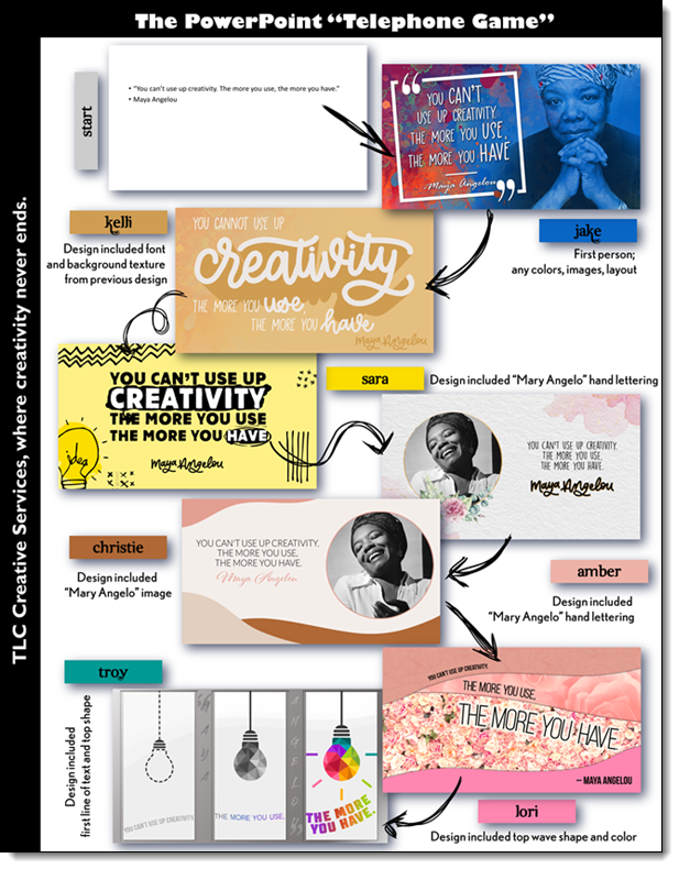
The TLC Creative design team is working remote and we are still having fun! With a twist on the elementary school game of “telephone”. Each designer had to use at least 1 element from the previous designer’s version in their design. Here are the results!
[videopack id=”13903″]https://thepowerpointblog.com/wp-content/uploads/2020/04/COVID-Challenge-2-Slideshow.mp4[/videopack]
Troy @ TLC
Challenge #1 of the TLC Creative Services COVID-19 Design Challenge!
Design a slide, or set of slides (up to 3 max), that integrates an amazing animation based on 6 circles. A “circle” is open to you to decide what that is. They can be small to large, any thickness, format, colors and styling effects. Your slide can be colorful, dark, monochrome – again, your design choice. Create an fantastic visual design, with even better animation.
[KGVID]https://thepowerpointblog.com/wp-content/uploads/2020/04/unnamed-file-1.mp4[/KGVID]
by TLC Creative staff presentation designer: Amber (1 slide)
[KGVID]https://thepowerpointblog.com/wp-content/uploads/2020/04/unnamed-file-2.mp4[/KGVID]
by TLC Creative staff presentation designer: Christie (2 slides)
[KGVID]https://thepowerpointblog.com/wp-content/uploads/2020/04/unnamed-file-3.mp4[/KGVID]
by TLC Creative staff presentation designer: Jake (3 slides)
[KGVID]https://thepowerpointblog.com/wp-content/uploads/2020/04/unnamed-file-5.mp4[/KGVID]
by TLC Creative staff presentation designer: Kelli (2 slides)
[KGVID]https://thepowerpointblog.com/wp-content/uploads/2020/04/unnamed-file-4.mp4[/KGVID]
by TLC Creative staff presentation designer: Sara (1 slide)
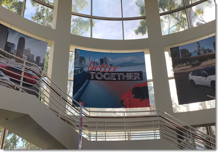
Received this photo from our client (thank you!). TLC Creative Services was tasked with developing the 2020 annual theme for the region, which was core to the kick off meeting PowerPoint template (TLC Creative Services also developed the PowerPoint template and formatted all executive presentations) and collateral materials. Here is the 2020 theme in the corporate office – I am guessing a huge 20’x20′ display!
Typography: The art and technique of arranging type to make written language legible, readable, and appealing when displayed.
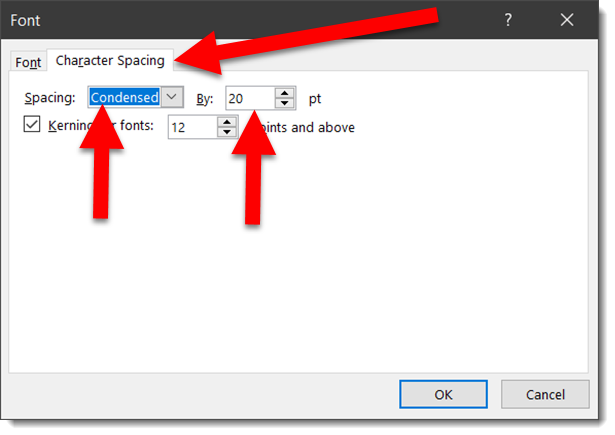
PowerPoint is a flexible design app. Sometimes it is not easy to accomplish design ideas as in other apps. As example, text kerning. PowerPoint does not use the design industry term “kerning” and the feature is not easily accessed.
For example, here is some simple, all caps, text on a slide.

To add some visual design, letter colors are updated to the TLC color scheme (RGB).

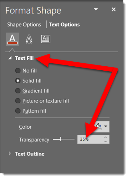
In preparation for the next effect, the opacity is lowered to 
Now the actual kerning, what PowerPoint labels CHARACTER SPACING. Select the text, open the FONT dialog, view the CHARACTER SPACING tab. Change the spacing option to CONDENSED, which essentially is negative spacing (so the 20 pt used is really -20 pt).
The result is the text slightly overlaps and the transparency overlap creates a dynamic visual.

Done. Custom typography styling created all within PowerPoint and remains editable text.
Download the editable slide HERE.
– Troy @ TLC
Typography: The art and technique of arranging type to make written language legible, readable, and appealing when displayed.
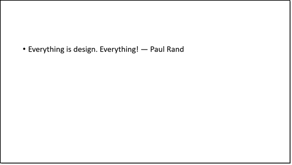
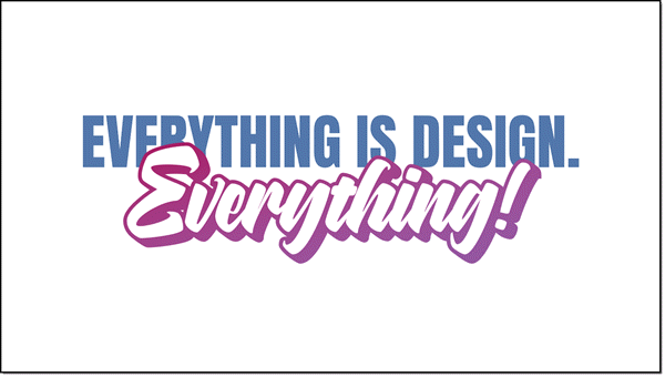
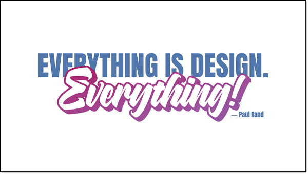
PowerPoint is flexible. Like many design applications, text can be more than bullet lists of black text on a white background. One aspect of graphic design is creating visually engaging layouts with just text. As example, here is a slide one of the TLC Creative design team created – all in PowerPoint.
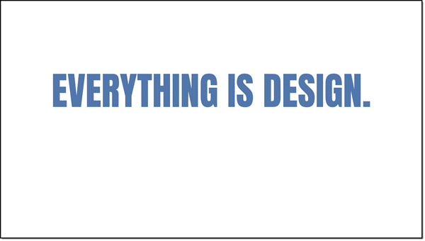
2. To start the layout, the first section of the quote was set with a new font, ALL CAPS, and new color
3. The final word of the quote has some more extension PowerPoint styling. Starting with using a custom font and applying a text gradient fill.
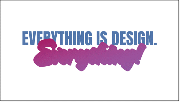
4. The custom font was a purposeful selection because the font family includes an outline version. The “everything” text box was duplicated, changed to the outline version of the font, set to a purple outline and white fill. Stacked, the two text boxes look great!
5. Last is adding the name as simple, small text in same blue as the top line.
6. As a final design flare, a background image was added and sent to back.
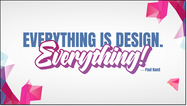
Done. A complete graphic design text layout, completed in PowerPoint.
– Troy @ TLC