The PowerPoint® Blog

I work with PowerPoint on a daily basis and I am very honored to be a Microsoft PowerPoint MVP. We have a talented team of presentation designers at TLC Creative Services and ThePowerPointBlog is our area to highlight PowerPoint tips, tricks, examples and tutorials. Enjoy! Troy Chollar

Before and After

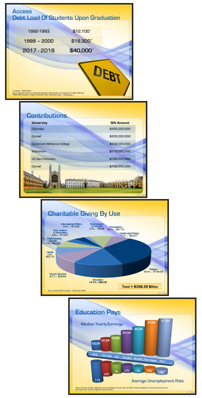
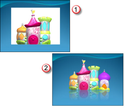
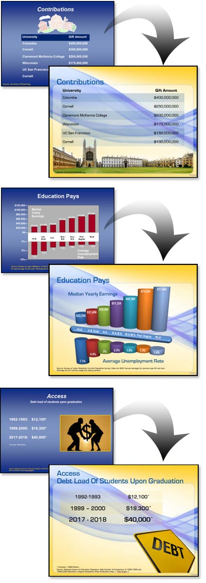
I received enough email since the last post to make me change my plans and show some of the Before-and-Afters from the project highlighted in the previous post “Higher Education”. As a side note: I have been collecting images for a month long series of before-and-after slides which should be good to go in May (don’t hold me to that) – and this is one of the posts you will see again 🙂

With this project I received a “raw” presentation and was tasked with developing a new template and updating all of the slides. The great thing about the presentation is the content for each slide was very minimal, allowing it to be big – dominant – and on a dynamic template.

– Troy @ TLC

By |2016-09-16T11:01:12-07:00February 26th, 2009|Portfolio|

Higher Education Presentation

This project was for a university program. They needed a template that integrated their school colors, but was lively-energetic-modern-cool. That was the direction provided and from there I was able to go in any direction. I developed 5 concepts and this was the one selected.

The template also used a custom font, which was installed on all presentation computers vs. embedding in the presentation. It featured 3 master slides:
1. Title slide
2. Content slide
3. Full Frame slide

The full frame layout is unique in that generally this style master slide removes the title bar to allow room for images/charts that need the full frame. In this template the title are is actually defined by the absence of the content area. So the Full Frame slide has the content area extended, creating a full canvas for content.

Of course there is a lot of competing visuals with a template like this. The background is full of contrasting, dominant shapes. It has a definite flow that draws the eye across the slide (from left-right). Lots of small text could easily become lost. And this would not be first choice for “standard” corporate template.

For this project I was provided the full (raw) presentation before any design work began and was able see the type of content. Because the content was large, minimal and to-the-point (eg. no inserted 200 cell excel charts or 20 bulleted lines) I was able to go with a more dominant and visual template design.

Here are few slides from the presentation:

– Troy @ TLC

By |2016-09-16T11:02:15-07:00February 24th, 2009|Portfolio, Templates/Assets|

Secret Saturdays Template

If you have boy, age 6-12, you a probably familiar with Secret Saturdays. This is a new cartoon series on Cartoon Network and with my 3 girls I was forced to enjoy some research watching several episodes to get in touch with my inner adventurous boy before developing this marketing template.

Working with entertainment properties, especially animated properties, is great. They have all the visual assets needed. And they are all high-res and layered (so no background).

For this project I assembled all of the characters into good and bad. Then selected the most vertical poses and went to work in Photoshop to create my layouts. The key characters (the good guys) are on the left, remain a constant throughout all master slides and positioned just far enough off the slides to not interfer with the content area. The background is a great line drawing the characters overlayed on the primary background color (pulled from the style sheet). And there are 4 master slides:
1. Theme (used at beginning and end of presentations)
2. Title slide
3. Content slide
4. Full Frame slide

Definitely not your standard corporate template – and I bet these presentations are more fun to sit through!

– Troy @ TLC

By |2016-09-16T11:02:43-07:00February 22nd, 2009|Portfolio, Templates/Assets|

Print – 1 Sheet

I did a series of print design projects and this is one piece from them. Working from a hand drawn diagram I recreated the flowchart and content in the coordinated colors and design scheme.

This is a standard US Letter size piece that was supplied to the client as a print-ready PDF that could be used on the local color printer or sent to a print shop for large volume printing, all from the same file as there is no ‘bleed’ (color extending to the edge), which was a purposeful element of the overall design.

– Troy @ TLC

By |2016-09-16T11:03:56-07:00February 20th, 2009|Portfolio|

Another Template

Here is the title slide from a recent PowerPoint template project. This one was great, because after it was approved the same design was then applied to other departments/divisions each disquinshed by having their own color scheme (eg. blue, tan, yellow tinting vs. the green tinting in this one).

For the project I was supplied with some great Disney art elements such as the Disney logo and the stars which I turned into a star trail that framed the text area and added a feeling of motion.

– Troy @ TLC

By |2016-09-16T11:04:16-07:00February 18th, 2009|Portfolio, Templates/Assets|

PPT Reflection Example

This is just 2 quick slides from a recent project, that were actually supplied to client before the real production began. The request was what could be done with all of the supplied images to give them a professional and consistent appearance.

I took this supplied image and first removed the background. I worked in Photoshop to do this. PPTs eyedropper would be an option, but it would remove any of the white inside the towers, which would really affect the right one. In Photoshop with the background removed it was saved out as a .png with transparency. The reflection was applied in PPT 2007.

I also grouped in another image (far right) to show how multiple images could easily be added to the layout, which was not an option with the opaque background on the originals.

Client liked the overall effect, approved it and then I got to work on slides and the other 30-40 images…

– Troy @ TLC

By |2016-09-16T11:04:36-07:00February 16th, 2009|Portfolio|

Multimedia Lecture

This is the lecture mentioned in the previous post. This is a great use of PowerPoint and is a great teaching tool!

For this project I was supplied with two items:
1. Raw video recording of the instructor/presenter (recorded by professional video crew with monitored audio recording).
2. PowerPoint slide deck instructor used.

The project process was:
1. Edit video to remove long pauses, audience comments (no handheld microphone for audience, so to quiet to hear on recording), pan & zoom (crop) to bring presenter to full screen (especially important as video of instructor is small).
2. Optimize PowerPoint deck for use in video.
3. Sync lecture and slides (this is time consuming when there is no cue sheet or wide angle recording to see both the presenter and the projected slides – but I did learn a lot about molecular genetics as I listened to the full lecture 3-4X’s!).
4. Setup the interactive table of contents.
5. Render video(s), which were .flv format. Instructor at 29.97 FPS and slides at 5 FPS.
6. Prep for CDROM playback.
7. Prep for local computer (hard drive) playback.
8. Develop custom installer to automate process of copying files to computer, creating shortcuts, etc.
9. Develop the launch/install app. outlined in previous post.
10. Test, test, test.

– Troy @ TLC

By |2016-09-16T11:05:49-07:00February 12th, 2009|Portfolio|

Launch/Install App

Like many projects that I work on, this one involved lots of software:
– PowerPoint
– Photoshop
– Flash
– Installer development/coding
– Video Editing
– Camtasia Studio
– and more

The actual project was a multimedia video lecture (highlighted in next post). But to provide a professional piece and give the end user a visual interface this ‘Launch and Install’ application was developed. The end user received a CDROM and when they insert the CDROM this user-friendly application automatically runs.

The Launch-&-Install application gives an intuitve graphic interface to running the lecture from the CD, installing the lecture files onto their computer, or viewing a quick tutorial on the lecture playback controls and options.

On the technical side, the application runs in a 800x600px window that is moveable and weighed in at just over 1MB.

– Troy @ TLC

By |2016-09-16T11:06:21-07:00February 10th, 2009|Portfolio|

CD Label Art

Many projects need to have multiple items all coordinate. Here is the CD label from a multimedia project that I used the same visual elements and layout style for a Launcher Application, video lecture series and this CD label.

This is the client proof which shows the center of the CD and a keyline around the actual circumfrence. The graphics extend beyond the actual CD size to give the printing process ‘bleed’ just in case the printing is not perfectly centered. The final print-ready file that goes to the printer does not include either of the black overlays.

– Troy @ TLC

By |2016-09-16T11:06:40-07:00February 8th, 2009|Portfolio|

Event Program Cover

This was a fun, and personal, project. My oldest daughter joined a swim team last year. Her team hosted the fist swim meet of the year (12 other swim teams attended with over 500 registrations!). I was asked to help design the cover for the program – which I of course said yes to!

– Troy @ TLC

By |2016-09-16T11:07:47-07:00February 6th, 2009|Portfolio|
Go to Top