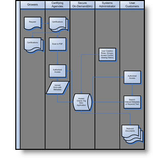
After I have interpretted what the data is saying (relative to content of industry and presentation), the need is to often recreate in a PowerPoint-friendly format. Here is the original provided, an MS Access piece.
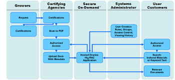
To make a clearer, easier to read, symmetrical and more aesthetic graphic here the same data recreated using semi-transparent autoshapes, color coordinated arrows and a layout that was as large as the template permitted.
– Troy @ TLC